We use cookies to improve your experience. Learn More or change your cookie preferences. By continuing to use this site, you agree to the use of cookies.
We use cookies (why?) You can change your cookie preferences. By continuing to use this site, you agree to the use of cookies.
At the time, everyone asked "Why?" And now, it's infamous. These are the origins of the Toronto Blue Jays' most hated jersey.
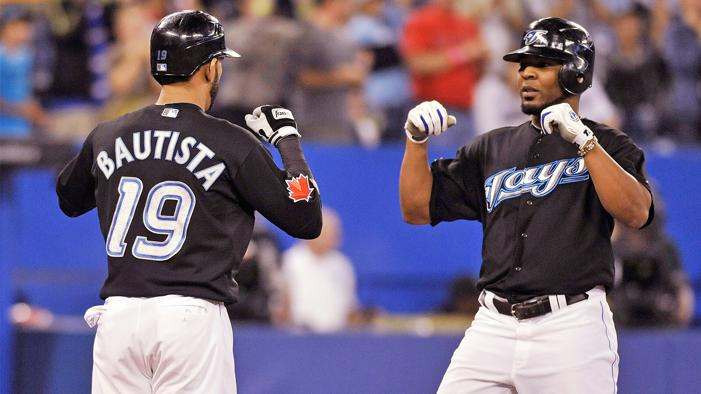
Jose Bautista takes a seat near a table in the middle of the Toronto Blue Jays clubhouse at Rogers Centre. It’s several hours before a mid-August game, so the right-fielder hasn’t yet donned his uniform. Instead, he’s wearing a loose, black, long-sleeved shirt, shorts and flip-flops. Hanging just a few feet away at his locker is his crisp, white, No. 19 home jersey.
Bautista, the longest-serving Blue Jays player, has worn several different Toronto uniforms in his nine-plus seasons with the team. Red, graphite and powder blue occupy spots on his spectrum, as does the royal blue that was on the slugger’s back when he launched the famous bat-flip home run during the 2015 playoffs. But when Bautista’s career is over and his history is told through photographs and baseball cards, one of the uniforms he’ll be pictured in will still irk Blue Jays fans.
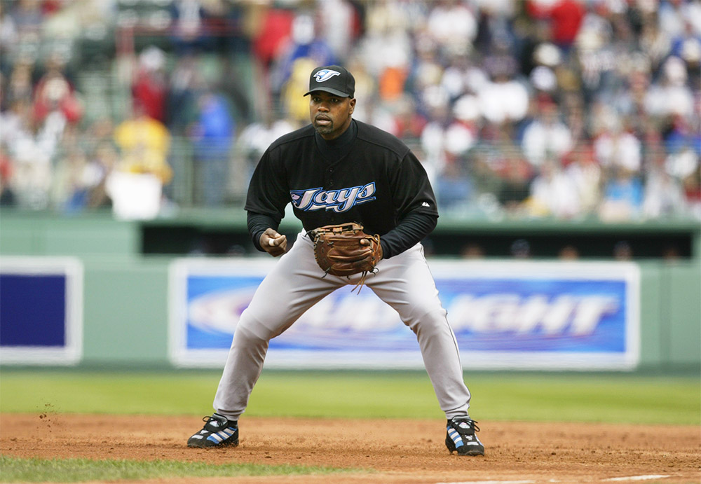
The black alternate jerseys Toronto players wore from 2004 to 2011 occupy a strange place in the team’s history. They were worn by some of the franchise’s all-time greats — Roy Halladay, Vernon Wells, Carlos Delgado, Edwin Encarnacion — yet those jerseys, and the logo that adorned them, are despised by everyone from fans to the club’s former general manager.
Bautista became a superstar in the era of that shirt, enjoying his greatest campaigns in 2010 and ’11, when he was MLB’s homer king and finished in the top four of MVP voting in two straight years. Despite those personal highs, he says the black jerseys don’t carry much sentimental value. “Nah, not really,” he admits. “Other than: that was the uniform when I got here. I remember that more than anything. I thought it was a little odd, though, that it was the ‘Blue Jays’ and then the uniform was black, but it was what it was.
“I did like the logo,” he adds. “The colours would throw you off a little bit. It would be like the Cincinnati Reds wearing blue.”
This is the story behind that controversial logo and jersey — the history and legacy of the black sheep of Toronto Blue Jays symbols.
Rays of light
The black alternate jerseys may be despised by fans and former GMs, but they were worn by some of the franchise's all-time greats — including Bautista and Encarnacion.
The Blue Jays stuck with their original logo from inception in 1977, through the World Series years in the early ’90s, and right up until 1996. A modernized logo was rolled out the following year, and it lasted as the primary option for the team until 2002. Then the club switched to a muscled blue jay holding a bat and ball next to a large ‘T.’ As this cartoonish logo became the team’s primary in 2003, work was already being done behind the scenes on a large-scale rebrand.
The organization had become a perennial third-place finisher in the American League East during a time when the New York Yankees and Boston Red Sox reigned supreme. In 2003, Toronto posted its best record in six years yet still finished third as New York won 101 games and Boston won 95. The relatively low value of the Canadian dollar further complicated things for the Blue Jays, who simply couldn’t keep up with rivals who boasted gargantuan payrolls. “We were in many ways the poor cousins. We had to draw more attention to ourselves,” says Paul Godfrey, who was team president from 2000 to 2008. “When you’re lingering, what you have to do is try to provide some excitement for the fans and a new look. That all has to do with the new logo.”
Research by the organization’s marketing department determined that black was a popular colour among younger fans — a key target for the Blue Jays, whose merchandise figures were slipping. “Selling merchandise is a very important factor for every ball team,” says Godfrey. “Whatever anybody says, I can tell you when they change logos and things like that, it’s to give a kick-start to merchandise sales.”
Brandid, a division of the advertising agency MacLaren McCann, was hired to create an entirely new logo. It was given two main points of direction: Focus on the bird and the word ‘Jays,’ dropping the ‘Blue.’ The team’s marketing department had concluded most people just referred to the club as ‘The Jays’ and wanted to coopt the simplified name. Brandid carried out its own surveys and found the Blue Jays’ core fans were males over the age of 50. “Instinctively, they knew that we’ve gotta get kids interested in baseball again,” says Randy Redford, former V.P. and creative director of Brandid and the designer of the Blue Jays’ ’04 logo. “Their objective coming out of it was, ‘Hey, we need to appeal to a younger fan and we need to create an identity that they’re going to relate to.’”
“The colours would throw you off a little bit. It would be like the Cincinnati Reds wearing blue.”
Redford’s creative process involved examining sports logos from around the world, along with brands that catered to young demographics. He also immersed himself in research about the blue jay and found it wasn’t well-liked by other birds because of its territorial nature and bold, bullying behaviour. Redford decided to draw on that attitude in the creation of the aggressive bird that ended up on the logo — a significant departure from how the team portrayed the animal in past emblems. “The eureka moment was at the point in which you figure out that the bird and the ‘J’ could nestle together quite nicely. It struck sort of a nice balance,” says Redford. “There was an edginess, a speed to it.”
The entire design process took less than a year, with Redford submitting about eight different concepts to the Blue Jays. The winning mark was tested by a consumer panel and eventually unveiled near the end of the ’03 season. The logo of the bird connected to the letter ‘J’ initially appeared on black and grey caps; the same symbol, with ‘Jays’ spelled out, was emblazoned on the team’s home white and alternate black jerseys.
The Blue Jays don’t disclose merchandise numbers to the public, but Godfrey and Redford recall a spike in sales figures after it was introduced. Redford says for that reason, his creation served its purpose while at the same time providing him with a once-in-a-lifetime opportunity. “Fans have a very emotional connection to the teams they follow,” says Redford, who’s also worked on emblems for the Toronto Phantoms, RBC and Rogers during a career that spans over 25 years. “I’ve heard my fair share of criticism over the years about this particular logo. That’s the one challenge with the design community. You can look at any designer and if they have designed a logo, people tend to want to criticize it.
“There are lots of variables that go into the creation of any logo, including the things the client wants to achieve.”
A little excitement
Godfrey describes the Jays as the "poor cousins" of the AL East and explains that the '04 jersey refresh was meant to "draw more attention to ourselves."
Chris Creamer vividly remembers the Blue Jays’ logo reveal in 2003. The Port Perry, Ont., resident is founder of Sportslogos.net, a website that documents team branding from across the globe. The site has always featured message boards, which allow Creamer to gauge how fans feel about different logos. Reaction to Toronto’s new look was pure disappointment.
One of the main criticisms was that it didn’t feature a red Maple Leaf — the first time in franchise history the symbol was missing from the Blue Jays logo. That detail took on extra patriotic significance the next year, when the Montreal Expos relocated to Washington and left the Blue Jays as Canada’s sole MLB organization. According to Redford, omitting the Maple Leaf was the Blue Jays’ decision, possibly made in an attempt to appeal more to fans outside the nation. “I do recall hearing, much to my surprise, that the hat was extremely popular in the Bay Area, California,” Creamer says. “Probably just because of the unique colours — no one had ever worn a hat that was that shade of grey before, especially in baseball.
“To be honest, if you take the cap logo, which is just the bird and the ‘J’ on their own, I think that’s a good logo,” he adds. “It’s certainly more aggressive. It feels like a bird that has some anger behind it — some purpose. … But it was when you add the wordmark to it: The ‘Jays.’ That’s where I think it lost a lot of its potential.”
The logo currently has a user rating of 4.5 out of 10 on Creamer’s site, with more than 1,000 votes cast. Creamer says any MLB logo under 6.5 is considered poor. By comparison, the Blue Jays’ current version is first place among primary team logos around the world with an 8.86 rating (from more than 2,400 votes).
Distaste for the uniforms never seemed to subside, and it didn’t help that the Blue Jays teams that wore them were largely forgettable. During the era of the black jersey, Toronto posted a combined .497 winning percentage and never reached the playoffs.
Former GM Alex Anthopoulos, who joined the organization in ’04 and had a front-row seat for all the struggles, summed up public opinion when the team finally broke its two-decade post-season drought. “[We had] those godawful black sparkly Jays jerseys and 1.5 million in the stands,” he told the National Post in 2015. “Our uniforms are amazing right now.”
One of a kind
Reaction to the jerseys was pure disappointment, but hats with the logo were "extremely popular in the Bay Area,” Creamer says. “Probably just because of the unique colours."
Bautista recalls when Blue Jays brass first considered a move away from the black. He says Paul Beeston, who replaced Godfrey as team president in ’08, asked players for their thoughts and feedback — should the club go back to its very first logo, or update the original? The Blue Jays ultimately decided on the latter, making the switch in 2012 to a logo and uniform that are both still in use today.
“I think the one we use now and the original one was better, but I didn’t think that the other logo, at the moment, was bad,” says Bautista. “When you feel like you have something original that is so good, why change? I think that’s what the true Blue Jays fans feel.”
Godfrey is keenly aware of criticism the black jerseys and “Angry bird” logo, as he calls it, have taken over the years, but notes that both were created based on sound marketing information. Still, he admits that during his tenure, the “right thing” would have been to go back to the original emblem. “I would say that the longer you stick with your original logo, the better off you are,” says Godfrey. “The New York Yankees don’t change their logo or the ‘NY’ on their uniform; the L.A. Dodgers don’t change their logo; the Detroit Tigers don’t change their logo. The Blue Jays are close to their original logo now.
“They should never change it.”
Photo Credits
Jim McIsaac/Getty Images; Brad White/Getty Images; Rich Pilling/MLB Photos via Getty Images; Chris Carlson/AP