
To understand how people in hockey analytics circles treat shot quality, start by going back a decade and looking at how baseball analytics treated a catcher’s impact behind the plate. In 2000, Keith Woolner wrote:
“If there is a true game-calling ability, it lies below the threshold of detection…. Players would need to play thousands more games than they actually do to have enough data to successfully detect such a skill statistically.”
Essentially the argument was that a catcher’s ability to affect outcomes through game calling and pitch framing was regarded as minimal because the data wasn’t there to prove it. As a catcher I could identify important aspects of the game that data ignored. It was incomplete and was being analyzed without regards to context. As a goaltender arguing the merits of shot quality it had a very familiar tone.
Thirteen years later the conclusion changed. As Ben Lindbergh wrote this past May:
” [Yadier] Molina has saved his teams 111 runs – or, using the standard 10-runs-to-a-win conversion, about 11 wins – because of framing from 2008 to 2013.”
In other words, his impact behind the plate went from being completely minimalized to being as valuable as Giancarlo Stanton in regards to WAR thanks to the availability of better data.
What it shows us is that relying solely on flawed data leads to flawed conclusions. It’s a problem that creates analytical blind spots across all sports. But when it comes to hockey and shot quality, I’ve decided to fill in the blind spot. To do so, I needed better data. This is where the Shot Quality Project began.
Everybody understands that there is a difference between Steven Stamkos on a breakaway and a Hal Gill point shot. The primary discussion point centers around the impact it has on large samples and whether it is something that can be influenced by a coaching system.
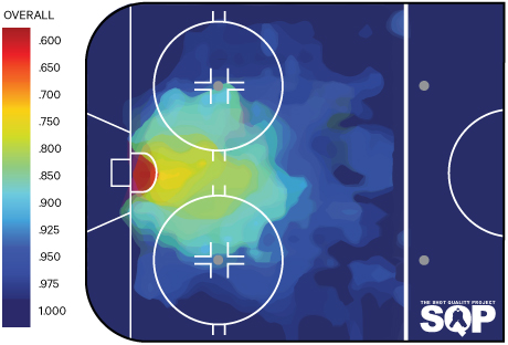
In order to prove shot quality – the white unicorn of the #fancystat world – actually exists, I decided to investigate the current available information and assess if there was a way to identify and mine better data. As you would guess, shot quality includes variables such as distance, type of shot and game situation. Alan Ryder’s study confirmed distance as being a determining factor in goal probability. So using shot location, I charted more than 33,000 shots on goal. The colour value is a representation of save percentage and it clearly indicates that the closer to the goal, the more difficult it is for goaltenders to have success.
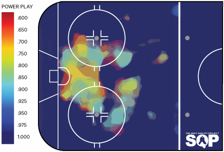
I then focused on penalty-kill situations. Isolating shorthanded shots provided a different look than all situations. There is less consistency and the gradation is not as consistent. High-scoring areas can be found out to the high slot and certain point shots.
My next step was to assess how the data was collected. The Ryder study used distance to differentiate quality. This data was mined from the HTML play-by-play data provided by NHL.com.
The league produces a detailed report of every game. Every shot is time stamped and labelled with a play number. Each shot event logs the team, player, the goalie, the game status (EV, PP, SH), the type of shot and the shot distance. But the data is flawed, because there is no location information – a 15-foot shot from the corner is a whole different animal than one from the high slot.
Michael Schuckers provided the next evolution in data collection. He produced a study that used shot location based on the NHL game tracker technology. When you combine the HTML information with location specifics, the data set becomes a better indication of quality. It provides the proper dimension and angle of each individual shot and, therefore, more reliability.
So now we know the game situation and the location of shots, both important aspects in determining shot quality. Those allow for a basic expected save percentage in various game situations. But it’s still not strong enough data to base a conclusive argument upon because data collection hasn’t changed in years. And since you can’t create code to mine measurements that don’t exist, conclusions remain static and the debate remains a waste of time.
There are also issues with the data gathered by the NHL (Observer bias has been noted in previous studies and MSG has been identified as a notable offender). My initial shot quality studies were centered on Carey Price. I tried to rely on location data, but noticed odd readings when I compared to visual references. So I tracked the 2012 season through both methods. The results were shocking.
If we understand that the slot is the most dangerous area, how can any study based on location provided by NHL.com be taken seriously? I followed up this study by tracking shot location in one game and checking for accuracy. Again the results were poor. Relying on inconsistent and inaccurate data was not an option, so I turned to extensive game-film study.
To lower the amount of data points I decided to break the offensive zone down into approximately three-foot-by-three-foot squares. This gave me 616 areas to track and analyze. I cut them off at the blueline because goals from beyond it are extremely rare, so I counted the neutral and defensive zones as one data point.
Shot location is one thing, but as a goaltender I understand that there are other variables that play making – or not making – a save. So if I was going to go through this exercise, I decided to do more than just prove the inefficiencies of NHL, I decided to create a new paradigm altogether.
Tracking velocity and screen shots proved to be a challenge. I wanted to avoid perception-based assumptions that could be easily infected with bias, so unfortunately they were removed from the research.
I decided to focus on the more accurate location coordinates and the three following criteria to supplement the current HTML supplied variables (team, player, the goalie and game status (EV, PP, SH))
Transition and pucks passed
Telescoping allows a goaltender to line up the shooter on an angle while setting depth. It’s the easiest way to ensure maximum net coverage. Unfortunately the available data doesn’t differentiate between a goaltender setting up for a shot or being forced to reset angle and depth while in transition. The shot locations may read the same, but the shot difficulty increases if a goaltender has to transition on the fly.
Unlike the perception-based analysis required for sight lines, assessing if a pass forces a goaltender to move laterally is trackable. I set my baselines around whether a goaltender was squared to the shooter and finished his transition at the point of release. This eliminated passes in the high zone in which goalies can easily transition with reset before the shot.
Rebounds
Considering the importance placed upon controlling rebounds, it is an amazingly invisible statistic. Yes, they are crudely tracked through the Ryder data by accounting for shots taken within three seconds of one another, but while tracking this manually I noticed there were a ton of mislabeled shots thanks to incorrect time signatures.
Rebounds-created is also a non-existent data point. Even with the three-second guideline, HTML data ignore rebounds created by goaltenders. Rebound shots have already been proven to have a higher conversion rate, so a goaltender who can absorb shots or direct pucks over the glass and into the corners creates a greater chance for defensively independent success than one who spits rebounds back into the slot. If a goaltender generates more rebounds, but faces less rebound shots, it could be placed in the category of a goaltender-dependent advantage – one completely independent from an individual skillset. Ultimately I want to assess how important this aspect is and its tangible impact on save percentage.
Tip-ins and deflections
Tip-ins are included in the HTML data and the majority of instances are properly labeled. It’s easy to understand the importance of tracking shots that suddenly change direction and the difficulty a goaltender has trying to adjust to a path alteration. Deflections, unfortunately, suffer from the same problem as the overall game data in that the information is largely inaccurate and sometimes contains the origin of the shot and not the location where the tip occurs.
After investigating the following five scenarios the blueprint for the Shot Quality Project was complete.
Using NHL GameCenter resources, I stripped the HTML data as my guideline to track individual events. I then reviewed streaming game footage through the NHL GameCenter app and manually tracked shot location. That included: the location of shots preceded by passes as well as the origin-point of the pass; deflection location as well as the origin-point of the initial shot; and rebounds and their placement points as well as the location of shots returned from rebounds.
Check back next week for my results. You won’t believe what you see.