

TORONTO — Leading up to the 2017 IIHF World Junior Championship in Toronto and Montreal, Hockey Canada and Nike unveiled Team Canada’s new jerseys. The new sweater will first hit the ice during the National Teams’ Summer Showcase, from July 26 to Aug. 6.
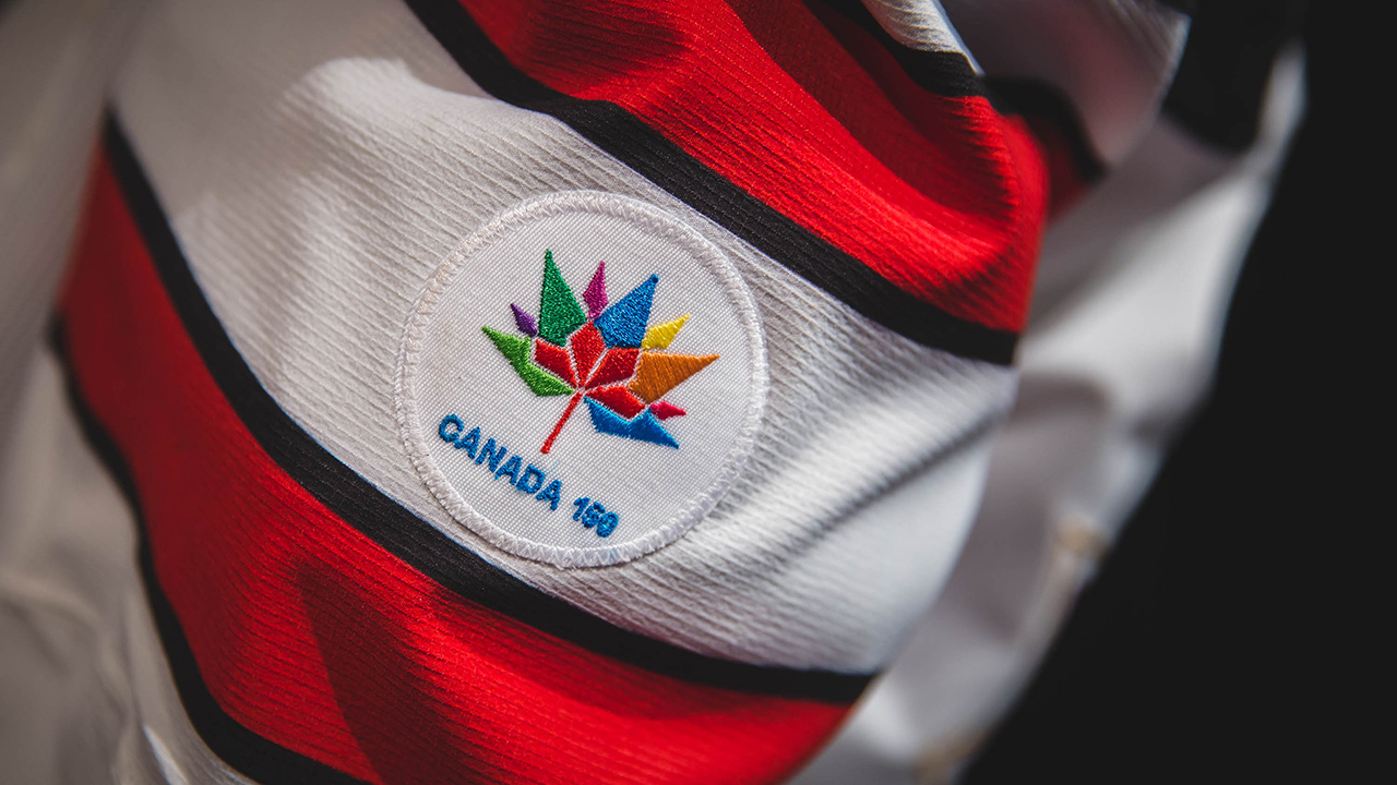
The coolest design feature is the Nike AeroSwift technology, which makes it the lightest jersey ever worn at the IIHF tournament. The Canada 150 logo, which can be found of the sleeves, celebrates the country’s 150th anniversary and is composed of a series of four diamonds that represent the four original provinces, forming the shape of a maple leaf.
(Charlie Lindsay)
Many players liked the gold outline on the Canadian crest in the middle of the jersey, signifying the medal of choice for members in the program.
At the jersey launch in Toronto I caught up with some of those players, Team Canada forwards Mathew Barzal, Travis Konecny and Mitchell Stephens, to get their first impressions of the new uniforms.
Here’s part of that conversation:
What are your first impressions of the new jerseys?
Stephens: Anytime you put on a Canadian sweater playing for your country it’s a huge honour. I really like the new designs. A lot of thought process and a lot of undercover meaning has gone into it, whether you can see it on the surface or you have to look deep. Some of the things that Nike has done with these jerseys are incredible. They are a lot lighter than I expected.
Konecny: It’s an honour to be able to be the first athletes to wear this jersey. To see what a big deal it is and all the technology that goes into the jersey, it is pretty cool to be able to experience this.
Barzal: It’s going to be an honour if I can represent with the jersey. The jerseys look great; it’s a symbol of Canada. The culture as well. There have been so many great players who have worn the jersey. For us to be the first of the new era to wear the jersey it’s going to be something special and Nike did a great job.
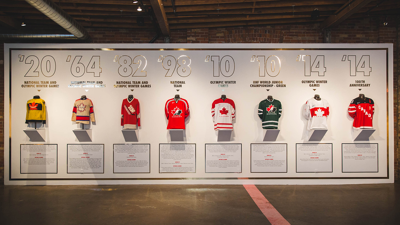
A look at jerseys of years past. (Charlie Lindsay)
What’s your favourite design element or detail?
Stephens: The bordering up in the shoulders. Having that one nation vibe to it is pretty cool to see.
Konecny: The aeroswift technology and it being the lightest jersey. I’m sure it will translate onto the ice (in speed) and it will help you performance wise. A feature I really like is the gold around the crest. It reminds us on the ice what we are going for. And the fans get to see that and it’s a reminder for them that we want to win gold for them at the tournament.
Barzal: Aside from the Hockey Canada logo, the gold outlining. Just a small little detail but I think it’s the expectation for Canada. You come in wanting to win gold.
If you had a vote, which jersey would you want to wear for the gold medal game?
Stephens: The red looks pretty sick. Even with the design on the socks that looks top notch.
Konecny: I like red. Red is my colour.
Barzal: I like white but I feel red is almost more intimidating. I feel like it’s the Canadian symbol. The red is sharp.