

TORONTO – Maple Leaf Gardens is dark. From the rafters, red and white concert lights draw figure-eights on the ice, highlighting the Nike swooshes pasted in the historic rink’s corner boards. In the middle of the ice, on carpet, mills a throng of media. And around the perimeter skate young men and women, some on sledges, dressed in Team Canada’s 2014 Olympic hockey sweaters for the first time. Ambient music plays. It’s 10 a.m. It feels like 2 a.m.
Given the artificial nightclub mood, “Are you guys still serving?” might be an appropriate question to ask the catering staff.
The official unveiling of the new sweaters kicks off with O Canada and ends with a bison sliders, poutine, smoked salmon and apple ciders, hot and cold. This is a meal being consumed at centre ice of the old Maple Leafs Gardens, the refrigeration cooling attendees from the bottom up. Canadiana is definitely in the building. If Nike could’ve convinced moose and beavers to replace the wait staff, it would have.
But although the polished launch had some of its impact sucked out more than a month ago—when a photo of a sad-faced Jonathan Toews wearing the new duds leaked to the public—we learned some things about the Sochi sweaters Tuesday that the immediate Twitter reaction and a pouting Stanley Cup champion couldn’t tell us.
Here are some insight behind the science and sentimentality of the sweaters Canada’s hopefuls will wear in Russia.
Nike’s embraces the criticism, finds the positive
When the Toews photo trickled to the Internet, 79 per cent of thousands of sportsnet.ca readers polled said they hoped the jersey wasn’t official.
“You want to be able to show the world what you’ve created and talk about it in a way so that people can understand what went into it, but at the same time it’s fantastic that people care enough about it that they want to know (early),” says Ken Black, Nike’s creative director for the Olympic line.
Criticism of the sweaters varied from mild to wicked. Some fans compared them to soccer jerseys or practice sweaters. Others pointed out that the black alternate version with the single red armband looked very, uh, German.
“We see what people are saying,” Black acknowledges. “As a designer, you want to create things that create an emotional response.
“We embrace the conversation. The fact that people are speaking about how they feel about a jersey that’s close to their heart and represents their country is a great thing. Our goal is to put the best jersey on the best athletes and have them go down in history with a performance in Sochi.”
Petro Canada logo? Not a muse
“That is not even close to the inspiration that we took when we designed it,” Black says. “Petro Canada is not part of any of our design research.”
Team Canada’s 1920 and 1972 sweaters? That’s more like it
Wanting to reach back to move the look forward, Nike invited Hockey Hall of Fame curator and keeper of the Cup Phil Pritchard to visit the creative crew with his quiver of classic Team Canada sweaters dating as far back as the 1920 uni. “That served as primary inspiration for these jerseys. The design team wanted to modernize it a bit, so you have an asymmetrical stripe instead of running across,” Black explains. “The other one that provided a tremendous amount of direction for us was the 1972 jersey. You think about the significance of that leaf on the front. That is blended into the stripe on these jerseys.”
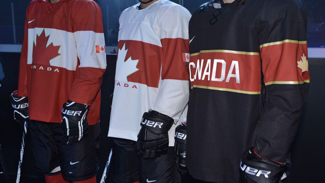
Team Canada is the only alternative
Because of Canada’s rich history in the Olympic ice hockey tournament, the country was the only one to get an extra sweater: a black number with “Canada” written in all-caps and lined with golden trim.
“We know the intent to bring back another gold medal is huge, so we wanted to bring to bear a black uniform that was sharp and made a very clear statement about Canada’s intent,” Black says. “The gold leaf on the sleeve we think makes a very clear statement about what we’re going to Sochi for.”
Clothes made of water bottles
In order to make the uniforms sustainable, recycled water and pop bottles are used in the fabric for both the jerseys and socks. It’s an environmentally conscious technology already used in the brand’s soccer and basketball jerseys. Seventeen water bottles are used in each sweater.
“We’ve kept over a billion water bottles out of landfills,” Black says of Nike. “As a designer, that’s an amazing thing to be part of.”
The challenge of the leaf
“The most important thing is the maple leaf,” says Joe Nieuwendyk, a gold medalist with Team Canada in 2002 who flew in from Dallas for the shindig.
But not being allowed to repeat past jerseys makes it tricky to come up with a unique yet effective design that does the leaf justice.
“There is a long tradition of executions that incorporate that maple leaf,” Hockey Canada president Bob Nicholson says. “From the past with information from the now, you can find a way to reinterpret or restate what is the central icon for an entire country.”
Nieuwendyk believes Nike has captured Canada’s history cleanly. “Red, white and the maple leaf,” says Nieuwendyk. “They’re going to feel the Paul Hendersons on their back.”
We talking ’bout practice?!
So, why did the designers steer clear of stripes at the bottom of the sweaters, a look frequently seen on practice jerseys?
“We went through a number of design phases with Hockey Canada,” Black says. “That was about streamlining the whole design so it was bolder and more impactful than some of the jerseys in the past. And if you go back in history, you see a lot of versions that don’t have the band at the bottom.”
Fake collar laces
Instead of actual rope, the collar of the sweater is “tied up” with faux laces, a concession to weight and performance.
“The laces are actually connected to an innovation called Nike Flywire, which is a super lightweight tension structure. In footwear it was created from suspension bridges so you can get amazing strength and support without very much material,” Black explains. “In order for us to remove the heavy banding around the neck, we needed something that would provide the lockdown support you can’t get with a single layer of fabric.”
A dozen leaves of gold
Twelve gold leaves are embroidered on the inside of each jersey to represent the Olympic gold medals Canada has won in men’s (eight), women’s (three) and sledge hockey (one).
Plenty of cooks in the kitchen
Because Hockey Canada is not permitted to use its mark at the Olympic Games, they partnered with Nike as well as the Canadian Olympic and Paralympic committees to develop the trio of sweaters.
According to Black, the two-year design process saw an “immense” number of drafts and iterations of the product you see now.
Nike presented about a half-dozen designs to Hockey Canada. The design then went back five or six times with alterations and adjustments based on Hockey Canada’s notes, and then the prototype was shown to the men’s, women’s and paralympic teams for their input.
“We have a lot of say,” Nicholson asserts. “Nike’s been very good, and there’s a push-pull getting to this point.”
So, who gets the money?
The replica jerseys hit shelves Tuesday and the authentic sweaters will be in stores on Dec. 4. Profits from the jersey sales will be split 50-50 between Hockey Canada and the Canadian Olympic Committee. Hockey Canada will make another announcement within the month about where those funds will ultimately be directed.
“It’s going to be a great statement of where Hockey Canada is with sports in this country,” Nicholson says.
The sweater’s physical weight…
“The key to this design is they’re much lighter than what we wore in Nagano or Salt Lake,” says Nieuwendyk. “They look faster, but the athletes are getting bigger and faster, too. It’s a sleek design. I think they’re going to love that light feel.”
In fact, the tops are 15 per cent lighter than any other sweater Hockey Canada has used.
“We believe that lighter means faster, so anything we can do to reduce that weight makes it better for the athlete,” Black says. “Every ounce is going to matter. From a performance standpoint, it’s going to make a difference.”
…And emotional weight
“As a player, leading up to those events, there’s a special feeling knowing that the entire country is going to be watching, and now as a fan I’m excited for what’s ahead five months from now,” explains Nieuwendyk, who first wore the national sweater as 19-year-old skating onto Copps Coliseum in Hamilton, Ont., for the world junior team.
“I didn’t really understand the magnitude of what it meant to wear Team Canada’s jersey until that moment. Skating out there in front of 20,000 people, flags flying everywhere, it was a special feeling.”
Cheryl Pounder, a two-time gold medalist from the women’s team (2002, 2006), has an intimate relationship with the sweater that dates back to the ’90s.
“At my first world championships when I was 17, I remember right before I put it on, I hesitated. And then I kissed it,” she says. “For the next decade, every single time, no matter where I was, when I put that Team Canada jersey on I kissed it.”