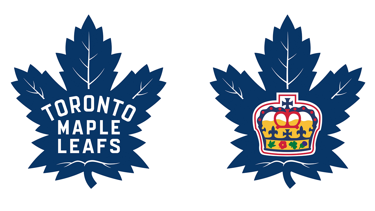
I must admit that I was concerned when I heard that the Toronto Maple Leafs were working on a new logo.
While the overall rebuilding plan has been accepted by most of the general public, I was relieved to see that a “re-build” wasn’t the philosophy behind the newest Toronto Maple Leafs logo.
Actually, I see more old in the latest logo, which is what I had hoped to see. I am glad to see nothing gimmicky or overly radical in the latest product.
Being both a Leafs fan for as long as I can remember, and having had the fortune to work for the team in a number of capacities for nearly 15 years, I have always had an appreciation for what the logo means. To me, the Toronto Maple Leafs hockey franchise is the equivalent of the New York Yankees, the Green Bay Packers or the Boston Celtics.
Though the team might suffer through difficult seasons on the ice, the equity of the franchise has no peers in the National Hockey League. There are many great NHL franchises and there are certainly many who have had more on-ice success for the past few decades, but that simple Maple Leafs logo has always remained a form of hockey magic.
Doug MacLean has teased me a number of times about my brief run as an NHL general manager with the Leafs. I tease him back that one year in Toronto is equal to 10 years of service in some of the places where he has been in charge. And, I do mean we are both simply teasing each other.
But I am serious about my experience with the Maple Leafs. American-born Brian Burke viewed it as the Notre Dame of hockey even before he got the opportunity to become general manager of the Leafs himself.
I am always partial to the Original Six uniforms. I imagine part of it is the history, but I also truly believe they are some of the very best NHL jerseys and logos. I like the distinctive two colours of the Leafs and not allowing any other colour into the mix. When I used to drop by the Leafs dressing room a few hours before game time, I would almost let out an audible gasp at the site of the jerseys hanging neatly in the player’s stalls.
It always made me feel like a kid again. The Maple Leafs were all I knew and all I cheered for as a boy.
I have to give Maple Leafs founder Conn Smythe credit for changing the colours from the green-oriented Toronto St. Pats to the current blue and white. Former Leafs publicity director Stan Obodiac once termed the Leafs colours as “white for the snow below and blue for the sky above.”
I still remain partial to the 1960s Leaf model because I think of that as the last truly great Leaf decade on the ice. Former Leafs trainer Guy Kinnear told me that those jerseys might have been fashionable but they were heavier material and laundry day was a big day on a Monday (which was pretty well always an off day). It took all day to wash and dry the heavier material and he said the dressing room stunk to high heaven all day.
I like this logo because it features the Leaf with veins, just like the ones you see on neighbourhood trees and then curse having to rake each fall.
![]()
I think the reason that I never really had an issue with whatever sweater style the Leafs wore was because that logo always shone through. I will say the only questionable era of Leafs logos was in the early 1970s when they got away from the one distinctive Leaf on the front of the jersey with smaller one on the shoulders. It looked like adult Leafs players wearing Leaf pyjamas, and at a time when they had some of their least talented teams.
Leave it to former owner Harold Ballard to make the Leafs jersey a major league issue for unusual reasons. In the late 1970s he was getting pressure from the NHL league office to adhere to a new league regulation mandating that all NHL teams have player names on the backs of jerseys.
Ballard was the last holdout (Chicago Blackhawks owner Bill Wirtz was of the same mind) as he believed that it would negatively affect programme sales and team revenues. Ballard finally did relent and the Leafs showed up for a road game in Chicago with names on the backs of their jerseys. The only problem was, the names were in dark blue on top of the dark blue jersey, so the names couldn’t be seen by the naked eye.
NHL president John Ziegler actually saw some humour in what Ballard did, but he sent another edict reminding Ballard that the names had to be in a CONTRASTING colour. So the next game Ballard relented, but only after his legal counsel, Bob Sedgewick, advised him that a league fine would follow if went through with his second idea.
This other idea was jerseys with the names in the appropriate contrasting colours, but only the players’ first names. So fans would have seen “Borje” pass it to “Darryl,” and “Tiger” pass it to “Lanny.”
Ballard actually did have those jerseys made.
The challenge now for the front office is to get the talent on the ice to match the standards of those great Leafs teams from the 1960s, while continuing the pride and history that should be associated with wearing the uniform.
For Maple Leafs fans, hopefully this new logo is the making of a fresh start given their incredible loyal support and passion.