Sometimes, it takes a truly awful uniform misstep for you to appreciate the quality of your team’s everyday garb.
When the Blue Jays took the field last weekend in the ill-conceived players’ weekend all-whites, looking like members of the Guilty Remnant from the HBO show The Leftovers, or the Backstreet Boys circa 1999, it was quite likely the worst aesthetic foul in the team’s history. Possibly even worse that their Canada Day jerseys in 2009.
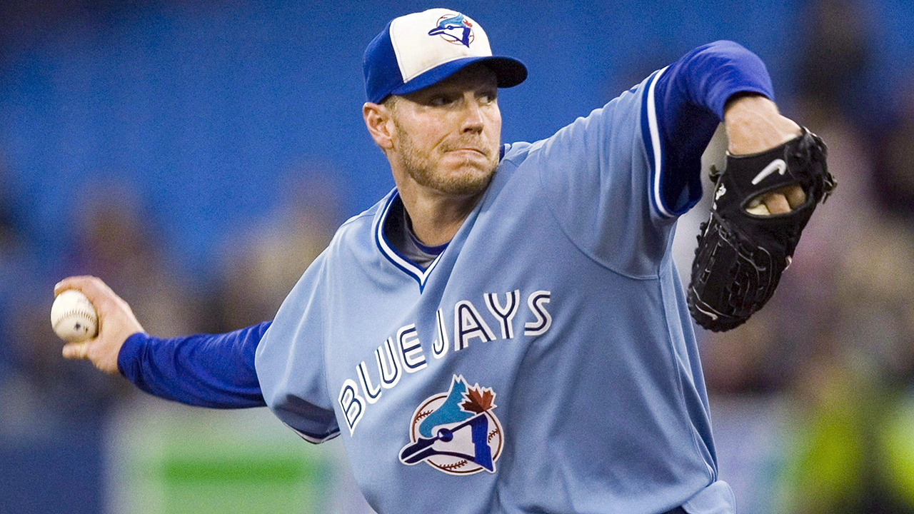
On the whole, though, Jays fans can be mostly satisfied with the state of the on-field wardrobe, at least since they introduced a classically inspired new set of uniforms in 2012. After eight seasons in the focus-grouped, farcical Black Jays kits, the return to blue was almost as much a piece of their renaissance as the return to competitiveness on the field. Walk around almost any Canadian city in the summer, and it won’t be long before one of the new iterations of the cap or jersey greet you.
If we’re rooting for laundry, as Jerry Seinfeld once suggested, it’s at least a relief to have laundry worth rooting for.
Having said that, it’s now been eight seasons since the return of the blue. While the uniforms are still resonant, and there is no need for a full refresh, some tweaks or additions around the edges might be in line.
And thus, are a few suggestions for how the Blue Jays might be able enhance their outfitting.
[snippet id=4545751]
A powder blue alternate
There remains a lot of affection for the light blue uniforms that the Blue Jays wore in their first 12 seasons, and the return of the full retro uniforms was a welcome respite to the black uniforms from 2008 through 2010.
Some other teams, including the St. Louis Cardinals and Philadelphia Phillies, have brought back their coloured 1970s era uniforms in recent years, and even the Washington Nationals played in old school Montreal Expos jerseys this year.
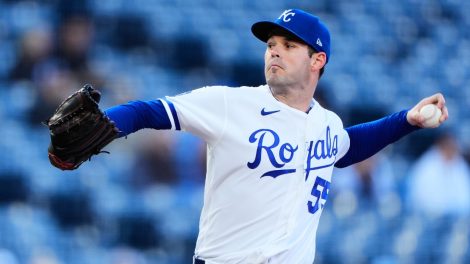
But it is perhaps the alternate jerseys of the Kansas City Royals that inspire the greatest envy amongst those for whom uniform nerdiness is an essential part of their fandom. A powder blue alternate that maintains the wordmark and logo of the current Jays would be a welcome part of the jersey mix.
The classic logo
Sometimes, you can grow so accustomed to seeing something that you lack perspective on its beauty. But uniform designer and sports branding expert Todd Radom in 2017 ranked the Blue Jays inaugural logo as the second-best MLB logo of all time, behind only the Yankees’ intertwined “NY”.
Radom called the logo “a modern classic…a memorable and classy look that is optically flawless.”
The classic logo makes the odd appearance around the ballpark and in promotional materials, but had been absent from the field since 2010, until it made a subtle comeback on the “Stars and Stripes” caps worn over the July 4 weekend this year.
The current logo does a great job of evoking the classic, while updating it nicely, but it was such a nice surprise to see the original logo for a few days. It would still be nice to see the Jays find ways to integrate this logo, much as the Milwaukee Brewers have with their classic “MB glove” logo in recent years.
3D logo on the batting helmet
One of the appeals of the Blue Jays logo – both classic and current – is that it looks even better when you see a textured version of it stitched onto a cap or uniform.
In recent years, several teams have added a textured logo decal onto their team’s batting helmets. The Chicago Cubs have used an embroidered logo for years, but since 2017, the Phillies, Cardinals, Los Angeles Dodgers and Chicago White Sox have added the raised logo on their batters’ brain buckets.
The Jays’ flattened logo looks especially diminished when it appears on their helmets with the white front panel, which is what brings this innovation to mind.
As far as switching from a glossy to a matte finish on the batting helmet, which has been a growing trend in MLB, that’s still a matter for some discussion.
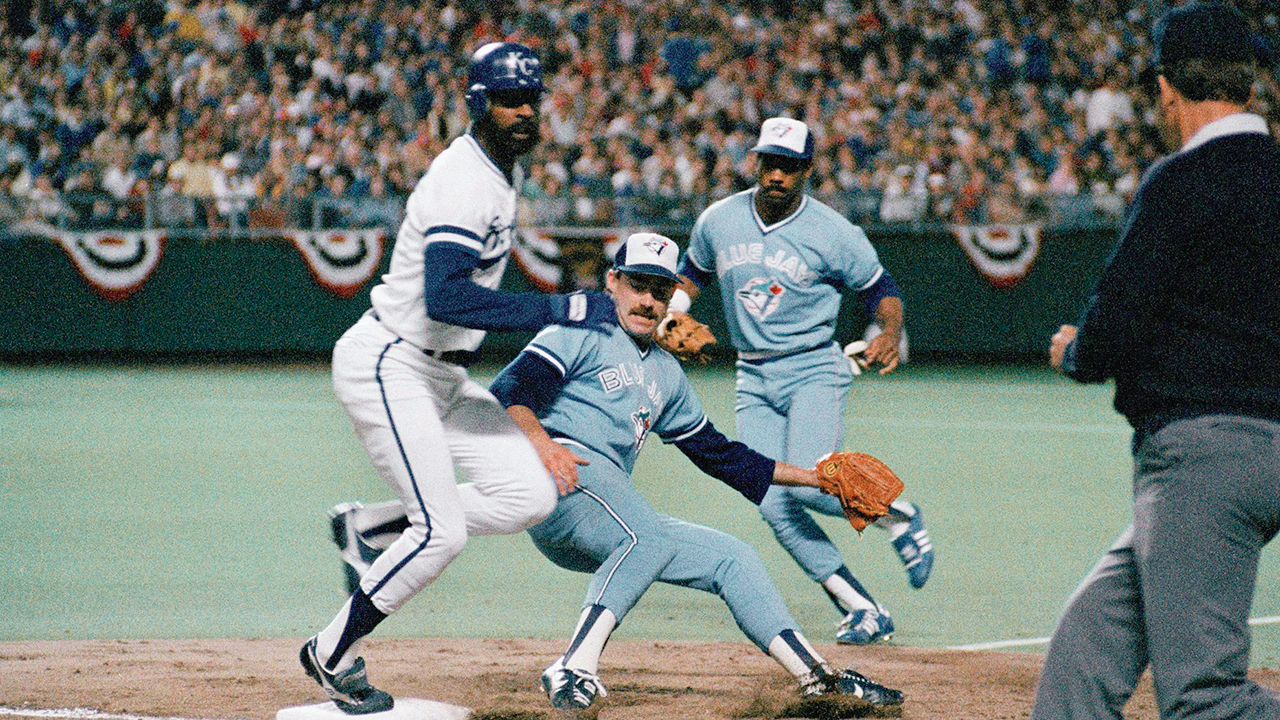
Salvaging the Black Jays era
There are very few Blue Jays fans who would take the contrarian’s view that the black Jays era uniforms deserve some measure of mercy, or a return to the field.
And yet…
The primary flaw with those uniforms was this insistence on using black as the primary colour, and shunting blue to an accent. It was such an overwhelming flaw that some of the design elements could be overshadowed by the uniform set’s original sin.
But what might a “fauxback” version of those uniforms look like if you were to adjust the colours? Would the “angry jay” logo look better on a light blue cap with a white front panel? Could the “toothpaste T” look half-decent on a blue cap?
There’s not much nostalgia for that era, but wouldn’t it be rather clever to reimagine the uniform that Jose Bautista and Roy Halladay wore through some of their best seasons?
[relatedlinks]