When the NBA announced that Nike would be manufacturing all of its jerseys this coming season, we knew there would be fairly significant changes across the league. But few could have expected this.
Each team will have four jerseys and the league is going away from traditional “home” and “road” uniforms, leaving it up to the team to decide when they want to wear their white jerseys (dubbed “Association”) or team colours (“Icon”). To date, most teams have unveiled their first two new looks.
The changes are fairly dramatic—even the teams whose look remains the same, iconic jerseys like the Lakers, Bulls and Knicks, feel significantly different with the Nike swoosh on the chest.
Jerseys, logos, colour schemes and the like are subjective, but I suspect on the whole people would agree that Nike nailed it (that’s not to say there aren’t some notable exceptions—we’ll go into more detail on those tomorrow).
To help get a better sense of the changes around the league, I caught up with Chris Creamer, founder and editor at sportslogos.net and one of the leading authorities on the subject to help break down the NBA’s new designs.
“On a league-wide level, the switch to Nike has resulted in cleaner, simplified looks across the board,” says Creamer. “You see a lot of teams getting rid of sublimated designs on the front of the jersey. The Phoenix Suns, for example, got rid of the stripes across the front. I’m curious as to whether the cleaner look was mandated by Nike or the NBA, but simple and clean appears to be where the designs are headed.”
“I’m surprised by the amount of changes,” he adds. “It seems almost every team has made some kind of change beyond the cut and the swoosh on the front of the jersey.”
So without further ado, let’s dive deeper into those changes with a look at, in no particular order, some of the best new uniforms in the NBA.
PHILADELPHIA 76ERS
The Sixers underwent their biggest change prior to the 2015-16 season, and their look, a nice blend of modern and classic, remains in tact amid the switch to Nike. Which is a (very) good thing.
Creamer: “They carried over what, to me, was the best feature on their jersey which is the stars down the side, and the old ‘Phila’ script across the front, which is a callback to the Wilt Chamberlain era Sixers.”
These jerseys were made for the moment. @Nike x @StubHub
| https://t.co/6T8joD2zRS pic.twitter.com/YwI4Ex6GBU
— Philadelphia 76ers (@sixers) August 1, 2017
“They didn’t change for the sake of change and only added a drop shadow to the wordmark and the numbers. Usually that drop shadow might not work, or can appear cheesy, but here it really works to help the letters and numbers stand out having that little bit of red on a blue jersey.
Hesi pull-up drop shadow
| https://t.co/3OsQg5dk7B pic.twitter.com/MNBu5lBEUb
— Philadelphia 76ers (@sixers) August 1, 2017
MILWAUKEE BUCKS
Bucks x @harleydavidson x @nike
The Icon: https://t.co/b0Af7FPMTt
The Association: https://t.co/GudqrFJ9md pic.twitter.com/Vz6bVOoBei— Milwaukee Bucks (@Bucks) August 10, 2017
Like the 76ers, the Bucks recently changed their look to help usher in the Giannis Antetokounmpo era, and their uniforms are mostly unchanged from last season. The Nike swoosh, one of the more agreeable brand logos around, and the Harley Davidson sponsor logo on the front are the only real changes, but both add something to an already solid jersey design.
Creamer: “What I love about the Milwaukee Bucks jersey—and you won’t hear this about the other teams in the league—is the advertising logo on it. Like Nike, the Harley Davidson logo is iconic in itself and it’s one of the few that people will buy merchandise just for that logo. The Bucks jersey itself was pretty good, but now you add the swoosh and the Harley Davidson logo, and that’s three good-looking brands on one jersey. That’s a very rare case of a sponsor logo adding to the design and that orange and black really pops.”
INDIANA PACERS
Introducing the new look of Pacers basketball.#WeGrowBasketballHerehttps://t.co/nq0ocBgCTb pic.twitter.com/hs431HC1gf
— Indiana Pacers (@Pacers) July 28, 2017
One of the more divisive, and perhaps the most dramatic, changes to any jersey this season, my first instinct was to dislike the Pacers new uniforms. But I have to admit they’re growing on me. I’m a fan of the Michigan Wolverines-like colour scheme, and I like that the wordmarks on the front forming a circle around the jersey number is unique, although I’m not sold on those stripes on the side.
Creamer: “The first time I saw these Pacers jerseys I tweeted something like: I want to hate this. As time has gone on, I’m falling further toward the ‘dislike’ side because it’s such a radical departure from what they’ve done in the past. To me it doesn’t feel like I’m looking at the Pacers. And for a team based on speed, pacecars and the Indy 500, these uniforms don’t give a sense of that at all.”
Our new look and Nike uniforms are here. Learn more about the inspiration and design at https://t.co/nq0ocByehL#WeGrowBasketballHere pic.twitter.com/ObUAIcXEtf
— Indiana Pacers (@Pacers) July 29, 2017
UTAH JAZZ
Another example of a team that underwent bigger uniform changes a couple of seasons ago and have paired the classic and modern nicely.
The Note x The Swoosh
It’s in the details: https://t.co/N7gYFsC0Mj pic.twitter.com/yCqkkGrgwr
— Utah Jazz (@utahjazz) August 9, 2017
Creamer: “Like Philadelphia, they kept what works. This is a look that fans of Utah have fallen in love with. Moving over to Nike they knew they weren’t going to mess with it just because they can, and that was the right decision. I believe Utah is the only team with a charity as it’s advertising patch—5 for the Fight—which is nice.”
TORONTO RAPTORS
The Raptors haven’t officially unveiled their new Nike digs yet, but we’ve seen first-round pick OG Anunoby wearing them when he took part in the NBA’s rookie shoot. Looking at these you get the sense that the team was a little ahead of the pack when they unveiled their current, simple, ultra-clean look back in 2015, and they fit in really nicely with where the league has gone with their uniforms today.
The @Raptors' @OAnunoby gets portraits shot by @babsphoto at #PaniniNBARookie shoot! pic.twitter.com/vzOWPh5eXa
— NBA (@NBA) August 11, 2017
Creamer: “On first glance, it’s cleaner. I wonder if it needs that natural border on either side of it. I like that they kept the two chevrons on the side pointing north—those arrows on the side is the only thing that ties together the majority of the uniforms over the team’s history. It’s a cleaner look, but is it better? That remains to be seen. The SunLife logo certainly doesn’t make it better.”
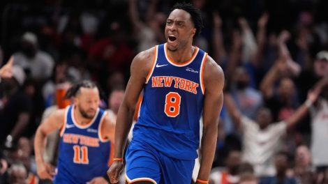
THE CLASSICS: NEW YORK KNICKS, CHICAGO BULLS, BOSTON CELTICS
The lesson here (and a bit of a theme, if you haven’t noticed): Don’t mess with a good thing.
FIRST LOOK: Say hello to the Chicago Bulls @Nike Association jersey, which will serve as our primary road uniform this upcoming season. pic.twitter.com/Q2c0bqDNcj
— Chicago Bulls (@chicagobulls) August 2, 2017
Creamer: “Not a lot of changes there, which is good, because these teams have their look nailed down perfectly. Chicago made a very minor change to their shorts by featuring the city stars from the city flag on the wasteband, a nice nod to the city of Chicago without changing their overall look. It’s a shame they don’t have the Air Jordan logo on their jersey in place of the Nike swoosh [like the new Charlotte Hornets jerseys do] but it still works because Nike and the Bulls are linked together so closely because of the Jordan era.”
Future Meets Future: @FrankLikina + @Nike Association & Icon Edition uniforms unveiled #NewYorkForever #Knicks pic.twitter.com/AshSNVkRxt
— NEW YORK KNICKS (@nyknicks) August 11, 2017
“New York didn’t change because they didn’t need to. It’s such an iconic, tested look, just like the Celtics and the Lakers. Regardless of manufacturer, that look shouldn’t change. It should always say ‘New York’ across the chest in blue and orange and simple fonts. Forever and ever.”
Check back tomorrow when we take a deep dive on some of the more egregious swings and misses from the NBA’s new-look uniforms.
[relatedlinks]