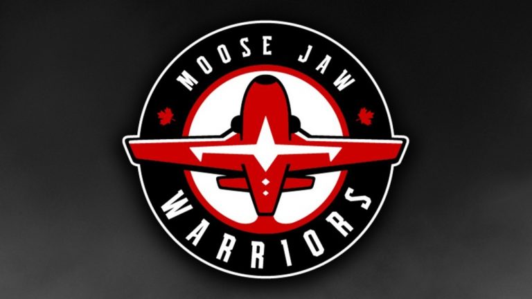
MOOSE JAW, SASK. — The Moose Jaw Warriors have changed their primary logo following a formal review.
The Western Hockey League team on Tuesday unveiled a logo inspired by the Canadian Forces Snowbirds air demonstration squadron.
The Warriors announced in October 2020 that it would conduct a review of their previous logo, which included a side profile of face framed by an Indigenous headdress, as the next step in an "ongoing internal discussion."
The review came as several sports teams were changing logos and branding considered derogatory to Indigenous communities, including Washington in the NFL, Edmonton in the CFL and McGill of U Sports.
The Warriors' logo features a CT-114 Tutor jet with the Snowbirds logo on its underbelly. A hockey stick is hidden in each wing, and the team's name is presented in a typeface inspired by aviation font styles.
The team's red-and-black colour scheme has been retained.
The team says in a release that the new design is inspired by the community’s connection with the Royal Canadian Air Force and the Snowbirds, who are based at 15 Wing Moose Jaw.


 4:26
4:26