Last week I introduced the Shot Quality Project and set the parameters of how the current data is collected and how I was going to improve on it.
The project merges the on-ice understanding from a goaltender’s perspective and a data-driven analysis of the sport. This is step two in the process of analyzing how shot quality effects a goaltender’s save percentage through defensive systems, and whether it is something that will dissipate over large samples.
With only a half season sample of data, you will not find any definitive conclusions yet, but there are enough interesting findings to alter the current paradigm. As I add to the database I plan to investigate coaching systems, compare and contrast goaltenders as well as apply the data to help evaluate other aspects of the game.
The current data ignores all pre-shot movement, so the focus of the SQP is to identify these shots and study the effects of this movement. Let’s start with the largest sample.
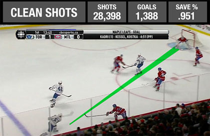
A clean shot is when one a goalie can line up while setting depth and angle using minimal lateral movement. NHL goaltenders face between 80 and 90 percent of their shots under such conditions.
Example: When faced with a clean look, goaltenders can set depth and angle maintaining a strong balance and controlling the rebound, giving them a high success rate even when the shot originates from the high-scoring slot area. A defence that can force opponents into such shots will help its goaltender maintain a high save percentage. Breakaways are included because the goaltender has the ability to adjust while maintaining visual contact with the puck.
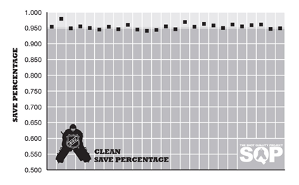
Comparing performance: I found a level of consistency among the goaltenders I researched in regards to performance in the clean category. After 28,398 shots, the average clean save-percentage was .951 and the fluctuation was fairly light. Above I charted the results of each individual goaltender and the difference between the best and worst result was 38 goals per 1,000 shots. A significant number, but one that represents the widest gap possible based only on the outliers in the study.
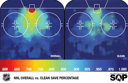
Heat Charts: Looking at this data, it would be pretty simple to hypothesize that the more clean shots a goaltender faces the higher the save percentage. When you remove all the pre-shot movement the heat charts indicate that even shots faced from the highest scoring areas yield a higher save percentage, if the goaltender can set and prepare for the shot. That’s not surprising.
But by focusing on just the shot type and not the location, it became quite clear that scoring success in the NHL was predicated on movement and deception. If you remove these elements even the worst goaltender in the league begins to look like Dominik Hasek.
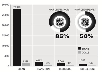
Clean shots account for 85 percent of a goaltender’s workload, yet only 50 percent of the goals and an average save percentage of .951. Contrast that to the .693 save percentage on transition shots and it’s pretty clear that a goaltender exposed to more transition opportunities has tougher job.
With that in mind I then studied individual games. I tracked clean shots versus save percentage on an individual game-level and found a trend downward. The more a goaltender is exposed to movement, tips or secondary opportunities, the more his average save percentage falls.
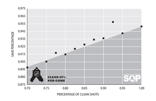
There were plenty of outlier performances thanks to the randomness of a 30- to 50-shot sample size, but when those performances were pooled together for a larger sample, the data showed that during an average start a goalie facing 90 percent or more clean shots had a much higher rate of save-percentage success than a goaltender facing fewer than 80 percent.
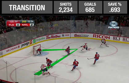
A transition shot is defined as one that is preceded by a lateral pass. These force goaltenders to reset depth and angle while in transition and is the most difficult shot to face.
Example: Without the ability to set, the goaltender has to anticipate, track, then laterally transition to cover as much of the net as possible. These types of saves are generally regarded as spectacular, but leave the goaltender in a poor recovery position.
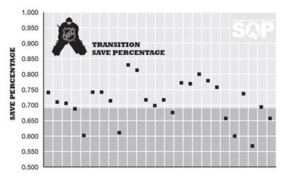
Comparing performance: Charting this in the same manner as I did clean shots, the results were inconsistent. After 2,234 shots, the average save percentage on a transition shot registered as .693. The gap between the best and worst results was 230 goals per 1,000 shots—nearly 200 goals more than the clean shot data. This is likely the result of the smaller sample size and I expect that gap to close as the sample size increases. I also expect that these results will be erratic because of the differing level of talent in transition and tracking ability.
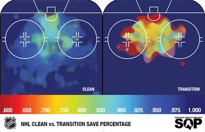
Heat Charts: Visually it’s obvious how the success rates change. It isn’t a coincidence that the majority of transition shots occur in the home plate area of the ice. When passes are completed high in the zone, goaltenders can adjust to the puck-travel distance with large shuffles or power pushes, which allow them to reset depth and angle. But this is more difficult to accomplish in the slot area. One-timers are deadly in these situations, same goes for backdoor feeds that take advantage of a goaltender’s blind spot.
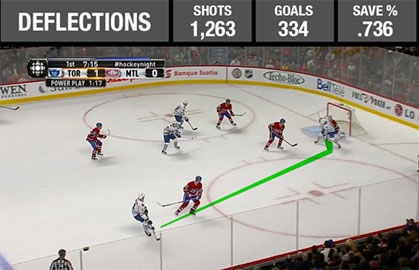
A redirection shot is one that is altered from its initial path by a deflection. It does not force a lateral adjustment, but adds difficulty, as the goaltender must set for the save on a different path.
Example: A deflection is difficult because it initially presents itself as a clean shot. A goaltender sets for the initial path and plane, but when they are altered the maximum coverage becomes compromised. Strong positioning can minimize the damage, but the closer the deflection is to the net the lower the chance for goaltender success.
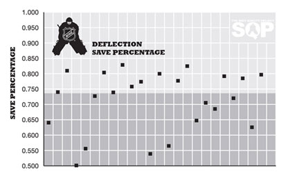
Comparing performance: Deflections are similar to transition in sample size and results. After 1,263 shots, the average save percentage on a deflected shot registered as .736. The gap between the best and worst results was 270 goals per 1,000 shots. It’s likely the results will normalize as the sample size increases, but I don’t think we will find the consistency of the clean sample.
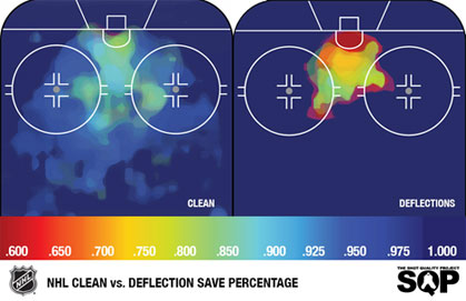
Heat Charts: The scoring chance project defines a scoring chance as any shot registered inside the home plate area.
It is clear in the heat charts that almost every deflected puck results in a defined scoring chance against. One problem I noted from the HTML data is the inconsistency in marking the deflection point instead of the point of origin. Goaltender success rates in the slot rarely top an 80 percent success rate, but as the deflection approaches the net it becomes a 50-50 proposition.
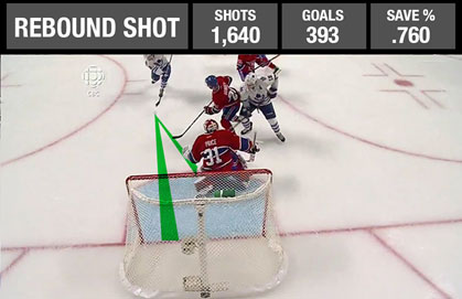
A rebound shot is one that occurs 1 to 3 seconds after an initial save. These shots may force a goaltender to reset angle while in transition
Example: Any rebound into the slot is a potential scoring chance if returned towards the goal in a timely fashion.

Comparing performance: Once again we have a very erratic data set. After 1,640 shots the average save percentage on a rebound shot registered as .760. The gap between the best and worst results was 191 goals per 1,000 shots. The small sample problem arises again.
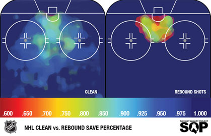
Heat Charts: Rebound shots, like deflections, occur almost exclusively in the home plate area. Although the success rate is lower than clean shots, it is higher than transition or deflection opportunities. In future studies I will isolate the success rate on rebound shots if a goaltender is square to the puck in contrast to when a re-adjustment must take place through a butterfly transition.
These early results do indicate that there is an undermined pool of data below the surface of the current research. There is a reason that even-strength save percentage is favoured over straight save percentage by the #fancystat community—it’s because shorthanded teams give up more high-quality opportunities of this nature.
I plan to use this extra layer of data to isolate why a player like Steven Stamkos can maintain a higher shooting percentage than the norm; contrast where Chris Kunitz receives the puck playing with Crosby compared to without; what type of opportunities Chara can and can’t prevent; if Tuukka Rask sees more clean shots than Ondrej Pavelec, and whether it matters; and, if the Maple Leafs have figured out a cheat code for the Fenwick close success model.
Next week: More heat charts.