

We sport them proudly on our chests, doodle them on our notebooks and, in select cases, tattoo them on our bodies. They are the 30 National Hockey League logos, and they vary greatly in terms of their aesthetic pleasure.
In a completely unscientific study to rank the current NHL logos from worst to best, we polled sportsnet.ca readers, fellow staff writers, and a select group of NHL stars for their opinions.
(Oh, and Alan Thicke for some reason.“I like some of the old classics: the Maple Leafs, Canadiens, Chicago, Detroit are tough to beat,” says Thicke, a huge hockey fan.)
Here are the results, with some ties broken by personal bias. To quote a Nick Nolte line from a movie whose title escapes me, “I don’t know what I like, but I know art.”

30. Carolina Hurricanes “Obviously ours is the best,” says Hurricanes 20-year-old forward Jeff Skinner, who is obviously biased and obviously too young to realize how lazily the ’Canes logo was designed. “Looks like someone just threw red and black paint against a wall,” says a Sportsnet co-worker who doesn’t know art but knows how to describe the sloppy mess on Skinner’s chest. And to think the NHL traded that glorious Hartford Whalers insignia (*sheds single tear*) for this Weather Channel glitch.

29. Minnesota Wild See how the majestic sunset and shooting star contrasts so jarringly with the angry, unidentifiable wildebeest face? Ugh. If you focus on the Wild logo long enough, you can hear the dude who designed the North Stars logo weeping. Seriously, are we playing ice hockey or going camping?

28. Anaheim Ducks “If I could change one (NHL logo), I’d change the Ducks back to the original Ducks. I like that cartoony one for the Mighty Ducks – that’s cool,” says P.K. Subban, apparently a closet Emilio Estevez fan. The flying arrowhead D has lost the Disney magic of the once-Mighty franchise’s branding, which looked like a goalie face mask mold was taken of short-tempered Donald when he was really peeved with Black Pete.

27. Columbus Blue Jackets The stars-and-stripes celebrates Columbus’s Civil War history, acknowledging that Ohio contributed more residents to the Union Army than any other state. Yet it comes off as the American flag going fast and furious. The goofy bumblebee-with-really-bad-pink-eye look doesn’t do it either. This is what the Blue Jackets main logo should be.

26. Colorado Avalanche Unlike, say, an actual avalanche, the Colorado hockey logo screams safe: a swooshy-looking capital ‘A’ topped with a glacier of snow. Not bad; not stunning. And wasn’t burgundy hot a couple years ago? Surely one of the rejected Denver franchise nicknames — Black Bears, Outlaws, Storm, Wranglers, Renegades, Rapids, and Cougars (the wild animal, we presume) – could have spawned a better visual.
![]()
25. Dallas Stars The Stars’ logo has never quite measured up to its Minnesota predecessor. And the new one unveiled in 2013 is slicker but not quite there. I’m backing the move to Celtics green, but any Dallas team trying to represent itself with a star will forever take a back seat to the Cowboys in terms of brand recognition.

24. Ottawa Senators Thank Jupiter the Senators went with an image of an Old World senator and not a modern Ottawa senate member. But as much as I like the HBO series Rome, it’s difficult to fully support a logo so intricate and gold. There’s an uppity-ness to it only a Sens fan can appreciate. More pesky, less pompous, please.

23. Nashville Predators Original owner Craig Leipold came up with the name Predators, which surely resulted in a better logo than the other nominees – Ice Tigers, Fury and Attack. As for that gigantic overbite? Back in 1971, a nine-inch saber-toothed tiger fang was discovered during the construction of the First American Bank in Nashville.

22. NY Islanders Erase from your memory those two seasons when the Islanders were sponsored by Captain Highliner, and the Isles’ cartographical look has been consistent, albeit a bit busy. See what they did there with the Y and the hockey stick?

21. New Jersey Devils It is as if a Disney-generated devil on your shoulder morphed into the letter N. Not to say that this is a Mickey Mouse organization, but there is a certain cuteness to the Devil tail and horns. Like the N is dressing up for sexy Halloween. A far cry from the artist’s rendering of the legendary Jersey Devil for which the club was named. Pittsburgh sniper James Neal says, outside of his Penguins logo, he likes Jersey’s best.

20. Phoenix Coyotes Winner of a name-that-team-we-jacked-from-Manitoba contest in 1996, the Coyote is a pretty shady desert creature. Saw one on a golf course once. Didn’t want to approach it. And while the original artsy Aztec logo was good and hideous, the simple howler introduced in 2003-04 allowed Phoenix to leap about nine spots in these rankings. (Side note: Were these the power rankings for All-Time Worst-Ever Alternate Logos, Phoenix would win hands-down for this all-out assault on good taste.)

19. Calgary Flames Ugliest logo? “Calgary. Easy answer,” says Sam Gagner. He would say that. He’s an Oiler – and we have to give Edmonton the Battle of Alberta: Aesthetically Pleasing Version. But just barely. Calgary’s flaming C is simple and effectively hard on the retinas, but it loses originality points for being a hand-me-down from the Atlanta Flames’ fiery A (1972-1980). It’s kinda like when you bought those Nikee shoes and the swoosh was backwards.

18. Washington Capitals “It’s literally just the word Capitals,” says a co-worker, who placed Washington’s logo on his ugly list. He obviously missed that enigmatic t: Is it a letter or a hockey stick? Make up your mind. Perhaps it’s the Star Trek font. Or perhaps it’s because, under the right circumstances, I could draw this. But I kinda like the Caps logo.

17. St. Louis Blues Named after a W.C. Handy song, “St. Louis Blues,” the Blues’ emblem builds on the popular “things with wings attached” trope and the not-at-all-popular clef note. (Other nickname considerations back in 1967 were Mercury and Apollo — space capsules built in St. Louis.) Again, its one-note simplicity strikes a chord.

16. L.A. Kings The Kings are on their sixth significant logo iteration, and this one’s better than most. While purists long for the Lakers-appropriated purple and gold, complete with a rounder crown, the LA crest is sturdy. Can’t go wrong with Raiders colours, either. Team’s logo lowpoint was when they brought in the royal-blue accents around the turn of the century.

15. Florida Panthers Unlike some of the logos on this list, the Panther makes wonderful sense: it’s a wildcat native to the state, and you don’t want to mess with one. Although Florida’s uniform colour scheme in underwhelming at best, the logo is just an angry kitty – and it’s coming for you. Well done.

14. Tampa Bay Lightning The lightning capital of North America is, appropriately enough, represented by a big bolt of the stuff. “I like our new jerseys we got last year,” says captain Vincent Lecavalier. The newfangled version, introduced in 2011-12, ditches the superfluous words and ’90s-style drop shadow for a slick improvement. Plus, it’s easy to doodle on your Finder Binder.

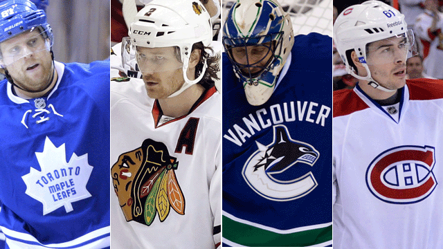
13. Vancouver Canucks Vancouver has chosen the safe route here. World War II-era political superhero Johnny Canuck fought Adolf Hitler, and as awesome as it might be to depict a bladed lumberjack taking down a global tyrant front and centre on Canucks sweaters, the whole orca-morphing-out-of-a-C thing works too, especially if you imagine Hitler imprisoned Pinocchio-style in the whale’s belly. Sportsnet.ca readers ranked the Canucks’ emblem their overwhelming favourite of the Northwest.

12. New York Rangers The Rangers don’t have a logo; they have a crest. The most badge-like of all the NHL logos, ol’ Tex’s Rangers emblem looks like something a patriotic 1930s boy scout would design if he was given three crayons to colour with during a family dinner at Medieval Times. Love this wordy logo because it would never get the stamp of approval from a modern brand marketing department.

11. Edmonton Oilers The Oilers logo is kinda like the Oilers team – it’s rooted in a youth movement. Inspired by O.G. owner Bill Hunter’s junior team, the Oil Kings, the Oilers logo was first emblazoned on the chests of World Hockey Association players and took a minute to gain NHL recognition. The colours have been messed with over the years, but the club was wise to return to the royal blue and punchy orange drop of crude. Nature’s Tang.

10. Pittsburgh Penguins “Morgan Freeman should narrate a film on how adorable this logo is,” says one Sportsnet writer. Pittsburgh’s team was christened the Penguins by Carol McGregor, wife of one of the original part-owners, because they played at the Big Igloo. The cartoony bird logo was replaced by a realist one, Baltimore Orioles-style, for a while in the ’90s only to return in the new millennium. If the tuxedo’d flapper could get his scarf back, he might have a chance at flying waddling up these rankings.

9. Boston Bruins Grocery chain tycoon Charles Adams brought an NHL team to Boston, and the brand colours of his First National Stores – black, yellow, white – to GM Art Ross’s Bruins. The eight-spoked B is a bold Original Six classic that fits well with the alliterative team’s reputation: big, bad, bruising, billionaire boss. But when the B’s strayed from the hubcap look and went with an image of an actual bruin, it went over like Zdeno Chara trying to cut the line at Schwartz’s. “That would be my least favourite,” Paul Bissonnette says, “the old Boston Bruins one, where they had the bear and the yellow jersey.”

8. Winnipeg Jets Not rehashing the tried-and-true original Jets logo was a bit of a bold move, but fans love it. In our Sportsnet.ca voting, only one team won its “best logo in the division?” vote by such a landslide. My dad, who has zero ties to the ’Peg, suddenly wanted a T-shirt with airforce-styled emblem. Ask anyone*: Planes are cool. (*Those obsessed with carbon footprint need not apply.)

7. San Jose Sharks “I like the new Sharks symbol on the black jerseys. It’s pretty cool,” says San Jose star Logan Couture. Lightning captain Vincent Lecavalier gives the Sharks’ symbol a thumbs-up too, and the teal sea monster ranked high with our readers as well.

6. Philadelphia Flyers Coined by owner Ed Snider’s sister in a name-that-team contest in 1966, the Flyers resisted the alliterative allure of spelling their name “Phylers.” They couldn’t, however, resist throwing some wings on a P and creating the simplest, strongest and greatest Atlantic Division stamp. Bonus points: Philly has never messed with its main logo.

5. Buffalo Sabres The greatest non-Original Six logo ever was generated from the Knox brothers’ name-the-team contest. Who knew two guys named Seymour and Northrup would agree on something so badass? It helps when your city’s name is also an animal. Seriously: Buffalos or swords – which extinct danger would you rather coming at you with speed? “Neither” is the correct response. “Being a Sabres fan, I thought the old-school Buffalo logo was pretty cool,” says Couture. He’s right.

4. Detroit Red Wings While Detroit’s status as the centre of the automobile universe has wavered, the Motor City’s hockey logo has not. The emblem practically smells like burning diesel and flies faster than Pegasus renting a Mustang.

3. Toronto Maple Leafs The Maple Leafs jersey is so iconic, even a francophone Flyers star concedes that it’s the best in the sport. “Toronto has the best logo. I gotta go with an original,” says Claude Giroux. “It never gets old, seeing those jerseys. That maple leaf is pretty cool. I’m Canadian, so that’s easy for me to say.” Fellow non-Leaf Matt Moulson seconds the motion: “I grew up loving the Toronto Maple Leafs and their logo.” While the sweater itself has seen no less than 15 minor alterations — the leaf itself experiencing various levels of veiny-ness — the simple blue-and-white endures. It’s like a New Era cap designer’s slick remix of the Canadian flag – except way better than a pink Yankees fullback.

2. Montreal Canadiens The hero of The Hockey Sweater, the Habs jersey is synonymous with championships. (Fun fact: The H in the logo stands for hockey, not Habitants; the C stands for club not Canadiens.) It is also the jersey most likely to be stained by victory champagne and/or gravy-soaked cheese curds. Perhaps P.K. Subban captures its essence best: “It’s not even the way it looks; it’s the history behind it, all the Cups. It’s unbelievable. That logo stands for more than just hockey, and it’s hard to find a logo around the NHL that has that, and there never will be one. Whether I’m there or when I’m dead and gone, it’s still going to be the Montreal Canadiens logo. I hope I can play my whole career there and live that.”

1. Chicago Blackhawks Perhaps there is a scientific reason why we’ve rated the Blackhawks’ native feathered warrior No. 1. Humans are instinctively drawn to images of humans, yet Chicago’s stamp is only one of two NHL logos to depict a human. Owner Frederic McLaughlin named Chicago’s team in 1926 after the 86th Infantry, a.k.a. the Black Hawk Division, for which he served during World War I. “It’s a classic logo, been around a long time,” the Oilers’ Gagner says. “Those are always the best jerseys – the ones that have the iconic symbols that you’ve had since you were a little kid.” BizNasty echoes that sentiment: “I’d say the Blackhawks have the nicest logo.” We agree. Maybe it’s the Blackhawks’ strong colours, their rich history, or the fact we can look the logo in the eyes. Or maybe it’s just the white guilt talking.