The image of Kawhi Leonard raising his fists to the sky after the Toronto Raptors won their first-ever NBA title in 2019 is an image most fans will never forget.
Equally as memorable is the uniform he and his Raptors teammates won it all in: Red with a white chevron with the word “North” inside.
That chevron became a symbol of success to the Raptors, who even featured it in their championship rings. But that design had always just been an alternate — until this coming season that is.
Unveiled Thursday morning, the Raptors are going all-in on that championship-clinching alternate design and may want to consider their new team slogan to “We the Chevron” with three new main jersey designs all featuring the now-familiar upwards arrow.
Judging by the teaser image of the new Raptors threads there’s likely to be an OVO gold and old-school Raptors purple versions of these new chevron designs as alternates for special occasions, but for the time being we have the three that the team revealed Thursday: The red, white and black “Association,” the red, black and white “Icon” and the black and red “Statement.”
Here’s a quick assessment of each new uniform and the one we like the most.
Association

Given the prominent white with just the chevron and number being red and black outline, this is most likely to be the Raptors’ new home jersey.
Of the three revealed, this is the most simple looking of the bunch, bordering on generic, even. And as critical as that may sound, that’s not necessarily a bad thing. This design is kind of like vanilla ice cream, a flavour basically everyone likes, even if it’s not all that exciting.
The generality of the design also comes with the advantage of not being able to notice the sponsor logo as much as the others — if the small logo on the top right of the jersey is distracting to you, that is.
Icon
![]()
Unlike with the “Association,” we are being critical here: Of the trio, this is the least aesthetically-pleasing of the bunch.
The black chevron looks strangely out of place with the design, although the black colouring of the number helps to correct that. But with the “RAPTORS” written in red text within the chevron’s black background, it throws off the jersey’s uniformity.
One aspect of this uniform that is nice, however, is the white trim around the numbers and letters, helping them pop out, an effective little detail in an otherwise not-so-great design.
Statement
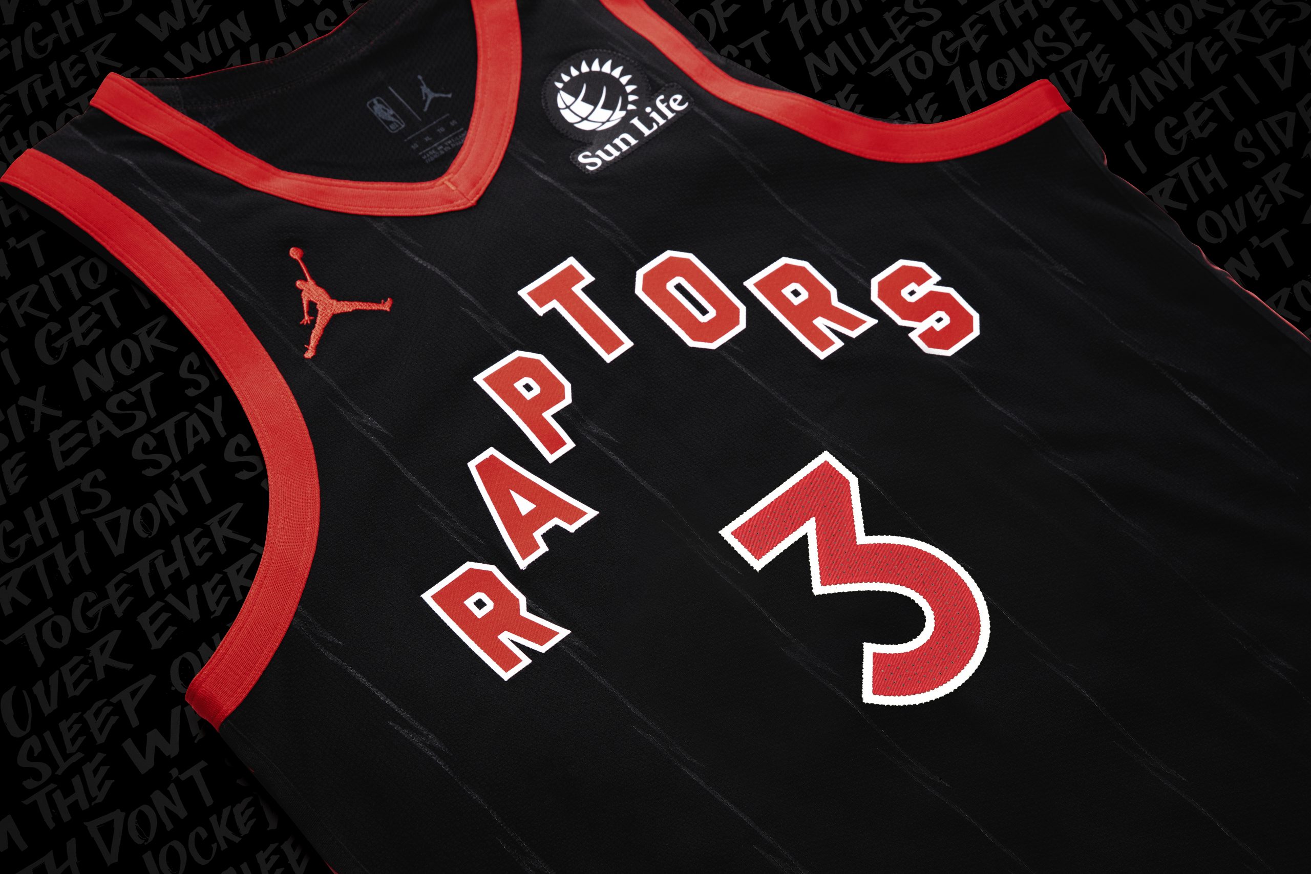
Reminiscent of the NWO Wolfpac, this is the most aggressive-looking uniform of the bunch with the black canvas helping the red really pop, aided by that nice white trim around the numbers.
One odd thing about this uniform is the fact you can’t actually see a chevron shape even though the “RAPTORS” letters are still positioned in the chevron formation the same as the other two. Instead, there’s very faint-looking pinstripes in the uniform.
Like the “Association,” this is more on the simple side of things but the prominent black of the uniform gives it a little more of an edge that lets it stand out more than that one.
Verdict
It’s not much of a competition between these three in our opinion. “Icon” wins by a wide margin.
It’s simple, but not too simple and the overall theme just makes us think that it would be in your best interest not to turn your back on the Raptors.
[relatedlinks]