The 2018-19 Premier League season begins Friday, and that means new looks for the players and supporters of English soccer’s top clubs. Only transfer signings and manager sackings rival the amount of media attention that kit launches receive during the lead-up to a new campaign.
Uniforms are about far more than the on-field product. They are a statement piece for a team and a city’s global identity.
Here’s our breakdown on the top five kits you’ll see this campaign.
5. Tottenham Hotspur
Tottenham harbours serious title hopes this season, and their new home (Tottenham Hotspur Stadium) is the design inspiration for their 2018-19 kit.
The home jersey is the traditional white and navy blue, with navy blue shorts, and blue and white socks styled after the architecture of their new ground. The away kit is binary blue, with polarized blue knit sleeves, which are meant to reinforce the team’s heritage and pay homage to the secondary blue used in many of the club’s past kits.
The team’s postal code and home coordinates are on the home uniform, a symbol of the loyalty of the fan base from the surrounding area in London.
There are messages on the inside of the collar of the home and away jerseys. The home version displays the club’s postal code (N17) and the coordinates of the centre circle at their former home, White Hart Lane. The away displays #COYS, short for “Come on you Spurs.”


4. Chelsea
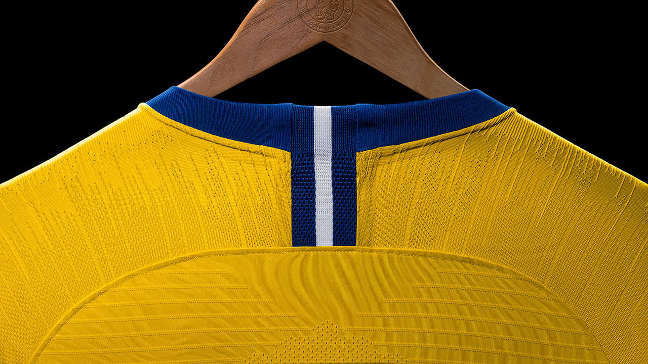
Chelsea is bringing back its classic yellow kit. The yellow jersey and shorts are complimented by a pair of blue socks that show off a yellow band across the shin.
First worn in 1963 and made famous in the 1970s, Chelsea’s classic yellow look returns this season for the first time since the 2014-15 campaign.
On the neckline of the top is a lion from the club crest. Around it reads, “Football is the game,” the second line of the famous Chelsea anthem. “Blue is the colour” is the first line, which features in the home jersey, tying together the home and away kits.
Chelsea’s new kit will be worn by the men’s, women’s and academy teams. The home shirt is the traditional blue, and takes inspiration from the jerseys of the 1980s and 1990s.
The uniforms from that era featured splashes of red, and that returns on the new shirt with horizontal red and white lines. Blue shorts and white socks go well with a horizontal red and blue trim at the knee. The new 2018-19 Chelsea home kit isn’t that new, as it was actually worn for the first time on May 13th during the club’s final league game last season.


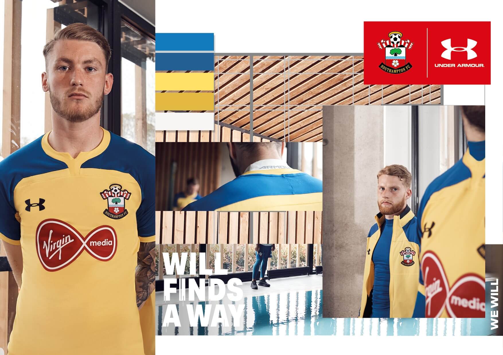
3. Southampton
The new home Southampton kit features a return of the traditional stripes. The away kit combines the yellow and blue colourway, which pays homage to the club’s FA Cup winning season of 1975–76.
The away kit brings back the ‘Brazil’ design of a yellow shirt paired with blue shorts. It is based on the template of the home jersey, without the stripes.
“Saints” and “We March On” are printed on the inner neck tape, and the cuffed sleeves and collar are black.
It’s the best-looking soccer jersey Under Armour has designed to date.

2. Manchester United
The latest Manchester United kit is similar the last few, telling a story about the club’s rich history. 2018 marks 140 years since the team was founded, and the home shirt includes a train track graphic, which links back to the club’s original name.
The team was originally formed in 1878 by the Carriage and Waggon department of the Lancashire and Yorkshire Railway depot at Newton Heath, and it initially played games against other departments and rail companies at their home ground at North Road, Manchester.
The black to red fading on the shirt is the best part of the new look, and is accompanied by black shorts, and red and black socks. Originally, the team wore dark shorts, so expect the black shirts at home often.
The alternate jersey is inspired by the 50th anniversary of United’s first European Cup win, the first for any English team. The navy-blue shirt is inspired by the royal blue kit worn by United in the 1968 European Cup Final. The jersey is made in partnership with Parley for the Oceans, the global collaboration network and movement dedicated to ending today’s major ocean threats. The best part is the away kit, which is entirely made with recycled materials.


1. Manchester City
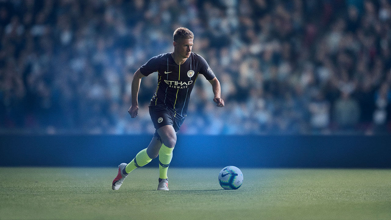
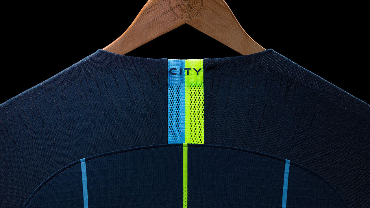
Drawing inspiration from key moments in the club’s history, the 2018-19 home jersey features the customary Manchester City blue colorway, with dark blue stripes along the arms and shoulders.
A return to navy socks echoes the kit worn when City first won the league title in 1937, and also in the 1998-99 season. The dark blue shirt with field blue and yellow pin stripes down the front and back recalls City’s away shirt from a playoff final in 1999. It is similar to the club’s away shirt for a playoff final against Gillingham taking them back up to Division One. Volt-colored socks with a dark blue band around the shin gives a distinguished look fit for the Premier League champions.
The kit will be worn by the club’s men’s and women’s teams.