
Juventus scrapped its classic logo for an updated modern version, which was unveiled on Monday.
The new logo took a year to create according to club president Andrea Agnelli, and it is described as “a symbol of the Juventus way of living.”
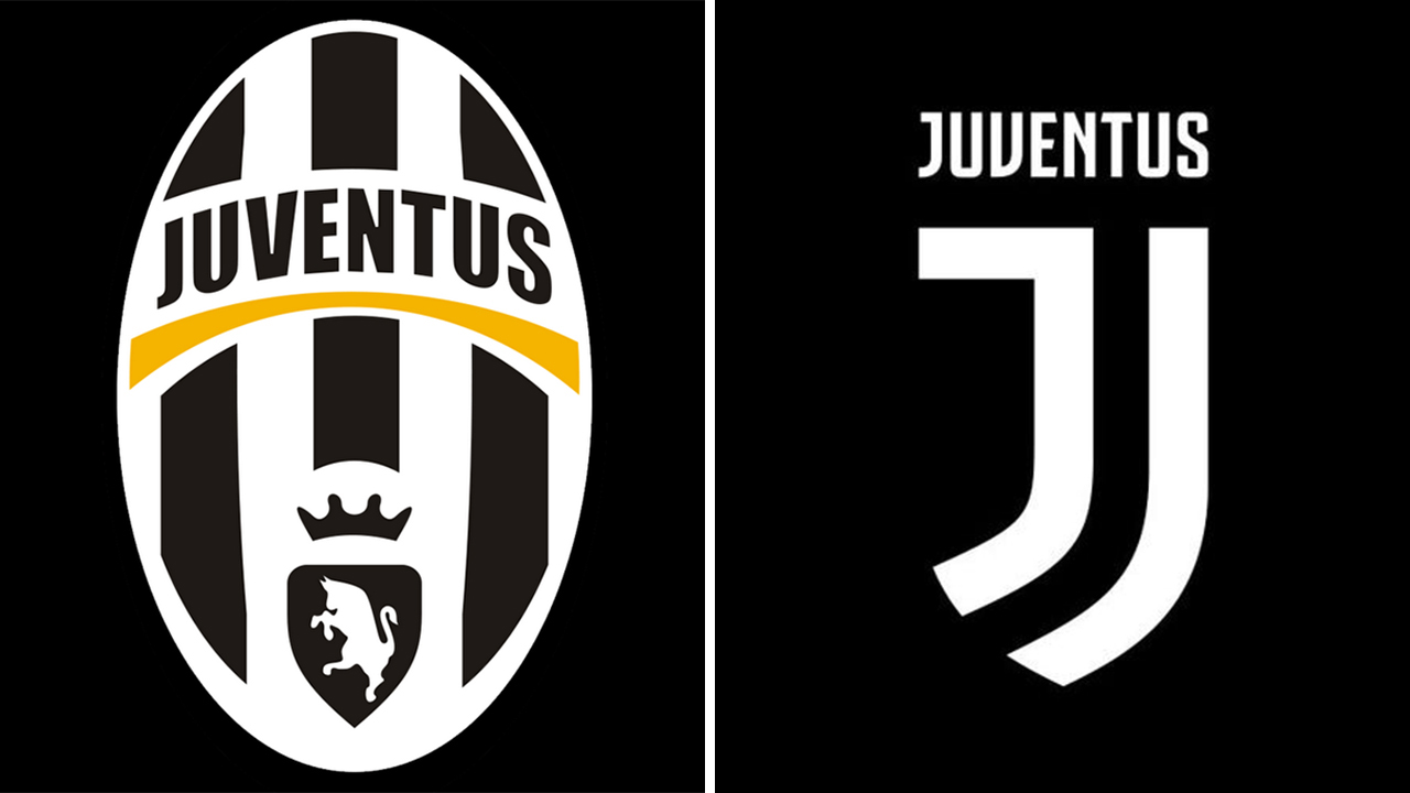
Juve’s new logo was not well-received by its fans, as most supporters tweeted mock versions of the crest and wondered why the club opted for a complete redesign.
https://twitter.com/Radek1897/status/821103072738996224
https://twitter.com/Radek1897/status/821102300265611265
However, it’s clear that the club wanted to be bold when it redesigned the crest. The Bianconeri’s emblem has been relatively unchanged since the 1920s. It featured a stallion and was usually surrounded by an oval shield. The previous logo was introduced prior to the 2004-05 Serie A season.
“We spent a year trying to find out what the new markets want,” said Agnelli. “But also to show a sense of belonging and looking to the future.”
Fans may not be pleased with the logo, but as long as Juventus continues its domination in Italy and wins trophies, it’s likely that the majority of supporters won’t care what logo adorns the jerseys.