Let’s face it. The Jays had it right to begin with back in 1977. Keep it simple, keep it classic. For the first two decades of the team’s existence, the Blue Jays had a sharp, distinctive look. The side-profile bird overlaid on a baseball, with the words “Toronto Blue Jays” outlining the ball in a split-letter stencil font. Even when the powder blue of the 1980s graduated to the white and grey base in the glory days of the early ’90s, everything was cool. No one looks at images of the Jays piling on each other after the 1992 World Series and cringes, thinking, “Damn, those godawful getups are distracting me from this historical moment.” No one gets vexed at the sight of Joe Carter leaping around the bases in his white uni after going yard at the SkyDome to win it ’93. The look was good; the game was incredible.
But then things got weird. The dream team was dismantled and the Blue Jays went patriotic—emphasizing the maple leaf and splashing red wherever they could. “TORONTO” and “BLUE JAYS” were written in ugly block letters. The bird morphed into something angular and robotic. Sick of that, to start the new century, the Jays essentially embraced the steroid era by introducing an anthropomorphic Blue Jay with bulging arms and a maple leaf tattoo, holding a ball and a bat while hugging a giant “T.” (In homage to the then-departed Jose Canseco?) Follow that with an unfortunate experiment with black and silver, and a pointy beak emerging from a stylized “Jays” written on an angle, and, ladies and gentlemen, the blue birds had jumped the shark.
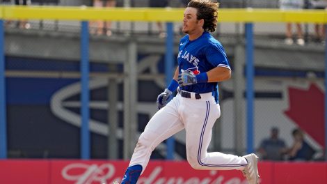
Sorry to force you through the Jays’ dismal days wandering a sartorial desert, but context is essential and fortune finds this story in the end. The Blue Jays’ redesign for the 2012 season brought the team back to the glory days, with an update on the old-school design. For years, the only popular Jays jerseys were the throwbacks. Someone finally took the hint. The team went to dark blue and white jerseys, with an alternate grey. The pants remained simple, as they always have—white or grey with two blue stripes. They returned to the original Jay, sharpening his features a bit, and putting a small maple leaf back on the right side. The redesign delighted the team and its fans alike. Jays caps became a Toronto fashion statement. “I couldn’t have designed them better myself,” said Jose Bautista. No way, Jose. Don’t even think about it. Messing with a good thing is what got us into this mess to begin with.