
TORONTO – For Jennifer Botterill, it was the Vancouver edition of Team Canada’s national hockey sweater, the one on home ice, the one on which she’d dangle her third consecutive and final Olympic gold medal.
For Tom Renney, it was the Lillehammer version, the one donned by the players—Canada’s last collection of non-NHL Olympic men—he coached to shootout silver in Norway.
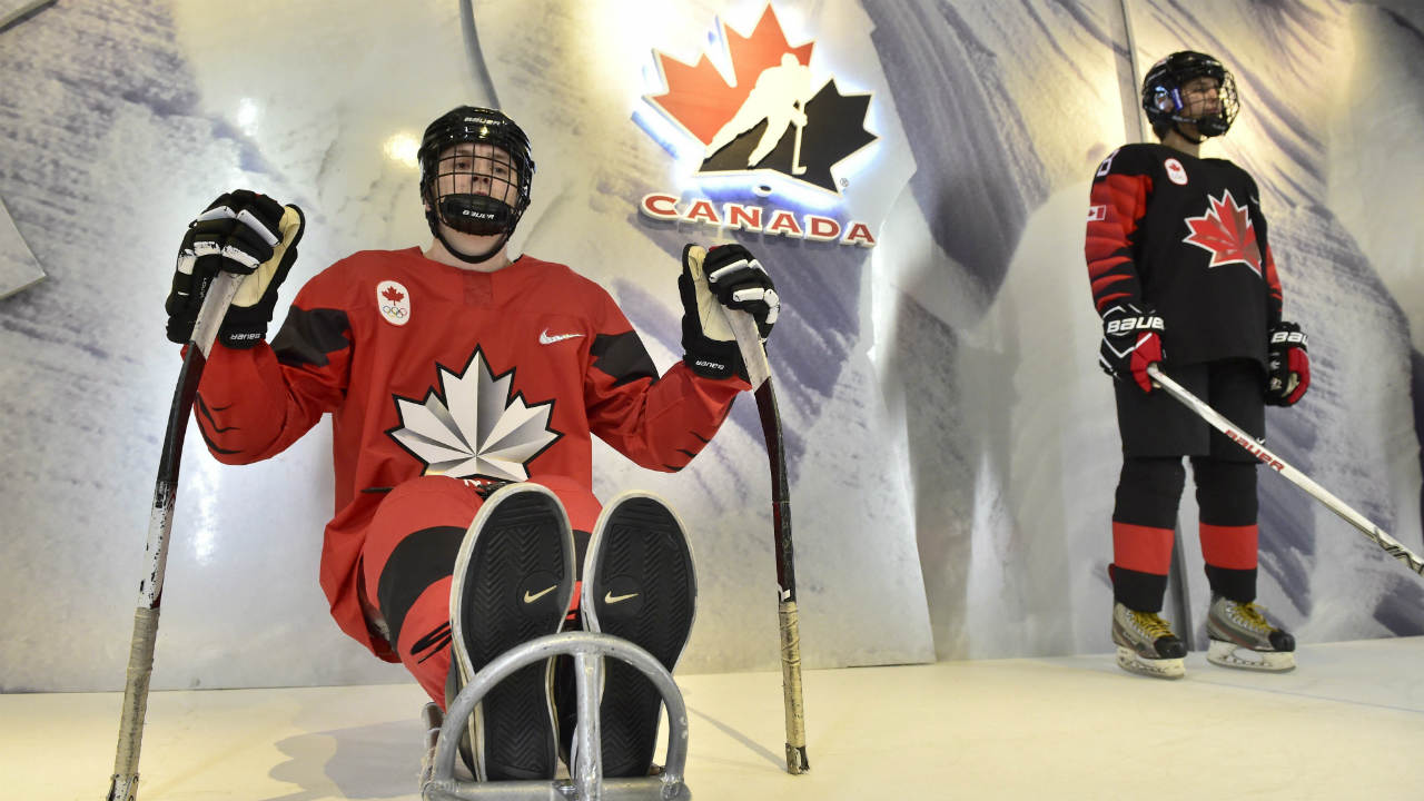
For 2018 Olympic hopefuls such as Ben Scrivens, Mason Raymond and Chris Lee, it may well be the brand-spankin’-new official Team Canada sweater, which was unveiled Wednesday in Toronto by Nike, Hockey Canada and the Canadian Olympic Committee.
That iconic piece of red-and-white clothing you immediately associate with a country, a sport, and a passion.
“You put that crest on, you put that jersey on, you get so excited, the hairs on your back—er, the hairs on the back of your neck, rather—stand up,” chuckles Todd Hlushko, who won silver on that Renney-guided ’94 Lillehammer team.
“It’s an unbelievable experience.”
It's here! #TeamCanada's hockey teams will be wearing this jersey in #PyeongChang2018.pic.twitter.com/EfmUacQnYP
— Team Canada (@TeamCanada) November 1, 2017
As is customary upon a jersey reveal of any sort, the new Nike-designed Team Canada (and Team USA) threads have already fetched their share of immediate criticism on social media.
Partly because the memories and heroes associated with a hockey sweater have yet to be woven in.
Canada’s new sweaters, which won’t be donned by the men’s, women’s and sledge players until the Pyeongchang tournament, stand out for their lack of stripes and splashy sleeve designs.
A large, modernized, stemless Maple Leaf crest—emblazoned on red, white and black sweaters—pops off the chest. A Canadian flag is affixed to the right arm, and a chrome-flicker Nike swoosh, inspired by a glimmering skate blade, gleams like a pendant on the left breast. (The word “CANADA” is absent from the alternate black sweater.)
“I like the look of this one,” says Renney. “There’s no doubt in my mind that the No. 1 hockey logo internationally is Hockey Canada’s logo now, and it’s been that way since ’95. It’s fantastic.
“When you look at the logo and you look inside the logo, you see the heartbeat of another Canadian.”
Nike, which has outfitted Hockey Canada’s five podium teams since 1996, designed a unique font for “CANADA” and the players’ names. Laser-perforated numbers on the back and both shoulders are applied with heat as opposed to stitching to increase breathability. Upgraded lightweight and breathable ripstop material is now the basis for each jersey, which incorporates more mesh (in the collar, for example) to increase ventilation.
New-tech flicker films—red over the Maple Leaf on crest; gold trim on the Leaf and numbers—have been incorporated so the jerseys will sparkle under the bright arena lights.
“I think they’ll be well-received. They look sharp. The focus on them being fast and fluid—you can see that,” says Botterill.
“On the technology side of things, even for me from ’98 to 2010, the difference was significant. I think about how heavy the jerseys were in ’98 or even ’02 compared to the next couple years as they got so much lighter. It’s almost funny to feel the weight of an older jersey. You do feel faster in the newer jerseys. You notice it as a player.”
The launch of Canada’s Olympic sweaters is timed as to fuel hype for February’s tournament but also to sell some clothing leading up to Christmas. Fans can purchase the red, white and black versions here for $159.99 a pop.
It’s important to both Hockey Canada and the COC that a portion of revenue earned from jersey sales will be funnelled back into not only hockey but the country’s other winter sports.
“To me, it’s symbolic of all of our sports, all of our athletes, and all of the people that love hockey across the country,” says Renney.
To Botterill, the image of the 2010 Canadian women’s nail-biting 2-0 gold-medal shutout of the Americans wouldn’t be the same without the flood of red-and-white sweaters inside that Vancouver arena and out.
“That was extra special, having the Olympic Games in your own country. When I see photos or video from that final game in Vancouver, everyone had their jersey on,” Botterill says.
“You learn about how much goes into the creation of the jersey, how many meaningful details go into them. I think people are going to love these new ones.”
[relatedlinks]