When the NBA announced that Nike would be manufacturing all of its jerseys this coming season, we knew there would be fairly significant changes across the league. But few could have expected this.
Each team will have four jerseys and the league is going away from traditional “home” and “road” uniforms, leaving it up to the team to decide when they want to wear their white jerseys (dubbed “Association”) or team colours (“Icon”). To date, most teams have unveiled their first two new looks.
The changes are fairly dramatic—even the teams whose look remains the same, iconic jerseys like the Lakers, Bulls and Knicks, feel significantly different with the Nike swoosh on the chest.
Jerseys, logos, colour schemes and the like are subjective, but I suspect on the whole people would agree that Nike nailed it. That’s not to say there aren’t some notable exceptions.
Earlier we looked at some of the best uniforms in the NBA this coming season.
But to help get a better sense of the changes around the league, and the missed opportunities for some teams whose new looks aren’t so hot, I caught up with Chris Creamer, founder and editor at sportslogos.net and one of the leading authorities on the subject to help break down the NBA’s new designs.
“On a league-wide level, the switch to Nike has resulted in cleaner, simplified looks across the board,” says Creamer. “You see a lot of teams getting rid of sublimated designs on the front of the jersey. The Phoenix Suns, for example, got rid of the stripes across the front. I’m curious as to whether the cleaner look was mandated by Nike or the NBA, but simple and clean appears to be where the designs are headed.”
“I’m surprised by the amount of changes,” he adds. “It seems almost every team has made some kind of change beyond the cut and the swoosh on the front of the jersey.”
So without further ado, let’s dive deeper into those changes with a look at, in no particular order, some of the worst new uniforms in the NBA.
CLEVELAND CAVALIERS
Paying homage to the game.
Paying tribute to our heritage.@Nike’s Association + Icon edition uniforms for the Wine & Gold.#AllForOne pic.twitter.com/5b1cHxZjW4
— Cleveland Cavaliers (@cavs) August 7, 2017
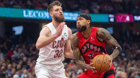
Not that you asked, but the wine/maroon and gold/yellow combination is my favourite in all of sports. I love the Redskins jerseys more than any other because of it, and want to love the Cavs digs for the same reason. But there’s just something remarkably unremarkable about the Cavaliers jerseys this season, which took an already lacking motif and made it worse.
Welcome to the Terrordome!! Let’s get this thing back going ASAP!! Savage Season 15 #striveforgreatness #savagemode #IFeelSoGoodRightNowItsScary
149.4k Likes, 3,299 Comments – LeBron James (@kingjames) on Instagram: “Welcome to the Terrordome!! Let’s get this thing back going ASAP!! Savage Season 15…”
Creamer: “This is a team that had a decent set last year that now has a far worse one. It’s just boring. There’s no excitement here. You have the league’s most famous player wearing these uniforms, and they’re boring. They say nothing. The white jersey doesn’t incorporate blue in any way — just champagne and burgundy. On the dark jersey, having dark blue numbers will make them hard to read. It just feels like change for the sake of change, which is what the more iconic, traditional franchises know to avoid.
“The Cavaliers have, for years, had the best player in the world. They’ve won a championship and have been in the Finals three years in a row — and they don’t have an iconic look. You get the feeling that they’ll probably just change it again in a couple of years.”
LOS ANGELES CLIPPERS
The Clippers last uniform change, implemented two seasons ago, was shocking in how god-awful it was. Instead of taking this opportunity to start anew, they’ve merely tweaked a terrible look.
The New Wave is here.
Get familiar » https://t.co/cpKEj3q7kW pic.twitter.com/beYWWNE5Oj
— LA Clippers (@LAClippers) August 11, 2017
Creamer: “The Clippers are one of the teams that made an improvement. But it was a pretty low bar they had to jump over. Their previous uniforms are terrible, and I think that was universally accepted. They’ve kept the same overall feel of the uniforms they’ve used the past two seasons, but got rid of a lot of the unnecessary stuff those uniforms had — the underscore under the word “Clippers”, removed some colours. If they’re rolling out the cleaner, more consistent look across the board, that’s a win for the Clippers. But it’s a pretty easy victory given what came before.”
MINNESOTA TIMBERWOLVES
The new threads have dropped. Bring on the New Era. #NewEraNewThreads pic.twitter.com/t0PjCcp8II
— Timberwolves (@Timberwolves) August 10, 2017
I’m all for it when a team tries something different, and it’s a part of what turned me around on the Indiana Pacers new uniforms. But with the Timberwolves this just isn’t working. The new colour scheme is nice— despite the noticeable lack of green— but everything else about this jersey, especially the awkward stripe across the chest, is a miss. It’s a shame for a team on the rise that’ll have more eyes on them since the Kevin Garnett era.
New Jersey's via @Timberwolves pic.twitter.com/g95OO9cA33
— A Wolf Among Wolves (@AWAWBlog) August 10, 2017
Creamer: “They went away from anything to do with their history. This team needs green. To me, the Timberwolves are blue and green. The stripe across the chest feels a little lazy. It has nothing to do with the team or its identity, and gives them a Washington Wizards feel. That’s a look that the Wizards — and Bullets before them — have made their own. It’s theirs. Let them have it. It just feels like you’re borrowing another team’s unique look, recoloured.
I like the idea of the ‘A’ in Minnesota without the line through it, an arrow pointing North. That’s a nice little nod. But everything from the colour to the font, to that stripe, it’s a fail. Which is a shame, because the new logo looks great.
DENVER NUGGETS
They changed their colour scheme a bit, going full-time navy, but for my money their lettering is the worst in pro sports.
Unveiled. #MileHighBasketball pic.twitter.com/RrlO1VYY1b
— Denver Nuggets (@nuggets) August 8, 2017
They're here. #MileHighBasketball pic.twitter.com/rZR3fdoEI1
— Denver Nuggets (@nuggets) August 8, 2017
Creamer: “On the blue jersey, the wordmark is yellow with light blue and white. You have a light colour, trimmed with a light colour, trimmed with white. It looks like a mess and will be hard to see with the players running around at full speed. Denver is another miss. They could have really done better. For a league that seems to be cleaning itself up, the Nuggets went another direction.”
NEW ORLEANS PELICANS
The Pelicans didn’t do anything to make their jerseys worse. In fact, by making the font size on the “New Orleans” lettering across the front bigger, they actually made their uniforms better. But it doesn’t hide the fact that these jersey’s still leave a ton to be desired and just feel really bland.
This is BIG: New @Nike threads coming to New Orleans! #Pelicans #NOLA ⚜️ pic.twitter.com/7boDbQUvt1
— New Orleans Pelicans (@PelicansNBA) August 10, 2017
Creamer: “I agree— the worst part about the old Pelicans uniform was the size of the wordmark. This team was clearly proud of representing New Orleans, to the point that they put the city name across the front of their home and road jerseys, and they still are. But they made the font size so small, smaller than any other team in the league. Increasing the size of the wordmark had to happen. I think it’s unusual that they didn’t put “Pelicans” across the front of one of their jerseys.
“With a city such as New Orleans and their history — they have their own design — and the Pelicans jerseys hint at that a little with their font, but for a city with such an iconic look to it these uniforms don’t quite take advantage of that unique opportunity.”
PHOENIX SUNS
Admittedly, I’m torn on these. I can’t decide if they’re cool or hideous. It’s one of the more dramatic changes of any team, but I’ll have to see it in action before knowing whether it works or not.
Inspired by the past. Built for the future. pic.twitter.com/QPShiJD64L
— Phoenix Suns (@Suns) August 10, 2017
Creamer: “Previously, Phoenix was a team that took a design and made it their own. There was no other team that had a wordmark going up diagonally from the bottom corner of the jersey to the top. That was something that they owned and nobody else could touch that. And they’ve gotten rid of it. It may be coming back as one of their throwback jerseys, but to get rid of it from your main set is a mistake. They’ve really simplified, which is a theme across the league. But this wasn’t a team that needed to simplify, and they took a step backwards as a result.
“The jersey numbers are ridiculously large — large enough to be seen from the Sun. The wordmarks are still nice, but to me the Suns have that streaking line across the chest. They could have tweaked it to make a little bit more like the ’90s, but instead they got rid of it completely.”
[relatedlinks]

