
Be honest: You have no idea what the hell the Philadelphia Flyers logo is either. For years you’d just see the logo and think “Flyers”—and nothing else. And that seemed perfectly fine. If you stop to think about it, the Flyers symbol kind of looks like a backwards Red Wings logo. Or an eyeball with stylishly long lashes. Or a villain from Pac-Man. The more you stare at it, the weirder it gets. What kind of psychedelic trip created this thing?
Whatever it looks like to you, one thing is true: The logo says, “These are the Flyers.” A distinctive design, impossible to confuse with any other brand. The genius is in the simplicity. And, OK, as many readers have certainly noted by now, it’s just a flying “P”—a soaring letter propelled by a four-feathered wing. The orange dot in the middle represents a puck. See? It’s simple. Basic symbolism led to one of the most identifiable uniforms in hockey. “[It] is an icon in sports,” said Lou Scheinfeld, one of the team’s original VPs. “It’s recognizable in sports. It’s clean. It’s simple. It’s powerful.”
The colours were picked in 1966 by Bill Putnam, a member of the expansion team’s ownership group and later the Flyers’ president. He reportedly wanted the new team to have “hot” colours. As an alumnus of the University of Texas, Putnam decided to adopt the Longhorns’ orange. Philadelphia artist Sam Ciccone came up with the uniform’s design, as well as that deceptively simple logo. He put a white stripe down each arm that expanded around the sleeve near the gloves. Ciccone said it was intended to look like wings, pushing the feel of speed and motion.
“If those shoulders made the player look a little bigger, well, as an expansion team, we thought we’d take any edge we could get,” Putnam told Jay Greenberg in his book Full Spectrum: The Complete History of the Philadelphia Flyers Hockey Club.
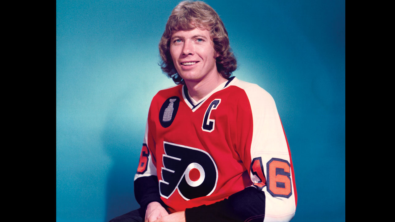
Since the Broad Street Bullies era in the ’70s, the Flyers’ look has stayed consistent—the regrettable Cooperalls seasons aside—and has grown in popularity even though the team hasn’t won a Cup since Bobby Clarke wore the “C.” And the colour belongs to the Flyers; it’s impossible to imagine another NHL team trying it. And the city has bought in—most nights, the Wells Fargo Center looks like a full-to-the brim glass of Tropicana.
Fashionistas might shy away from the Halloween hues, but don’t expect to see the Flyers shift their palette any time soon.